BHP Standardised Work App and Starter Kit
Overview
BHP embarked on a digital transformation project to replace their paper based work instructions and improve their workflow with two iPad apps: the Standardised Work App (SWA) and the Starter Kit.
The SWA was designed to provide step by step instructions to mining workers, improving task execution and ensuring quality in varied workplace conditions.
- Role
- User researcher
- Client
- BHP
- Consultancy
- PwC
Two iPad apps to replace paper work instructions


What Doers said in research
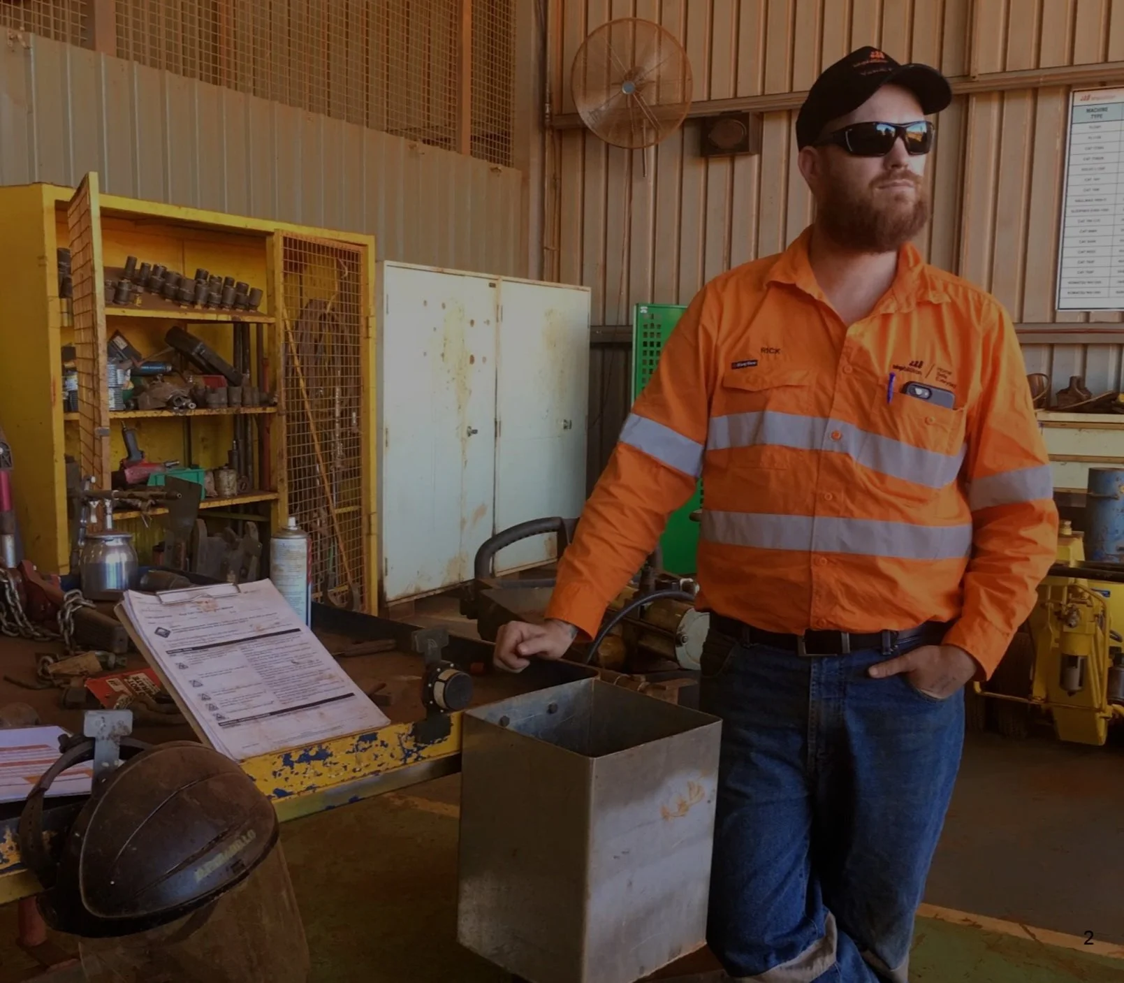
“We need to move ahead with the times. An app would definitely make it easier than following paper based instructions.”

The problem
BHP set out to replace its
paper work instructions
with two iPad apps
BHP asked PwC to fold three kinds of paper instructions into one app.
Client challenge
BHP assigned PwC to consolidate their complicated paper based Standardised Worksheets (SW), Work instructions (WIN) and Preventive Maintenance Instructions (PMI) into a coherent single digital application, the Standardised Work App (SWA).
- SW
- Standardised Worksheets
- WIN
- Work instructions
- PMI
- Preventive Maintenance Instructions
- Into one app
- Standardised Work App (SWA)
The target
The goal was to increase the adoption of standardised instructions by workers in order to reduce waste (in work process) and improve the quality of work.
The approach
Research plan
Site tour
What we heard
User groups
Key themes
User flows
Research plan
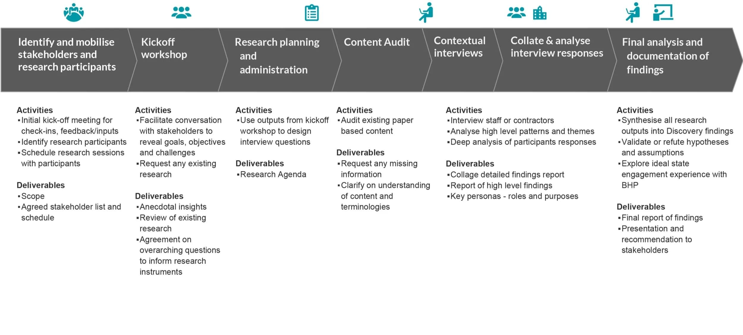
I planned the research in seven stages, from lining up stakeholders and participants to presenting the findings and recommendations to stakeholders.
- We ran a three day kickoff workshop with BHP stakeholders on the paper work instructions, how each user group used them, and the project vision.
- Together we named the drivers, goals, constraints and likely blockers early.
- After the workshop we audited the paper content for gaps and opportunities.
- We then interviewed users on site at the mines about the technology they already used, how comfortable they were with it, and what they understood of standardised work.
Site tour
Over three days at 4 BHP sites, participants showed us around their workplace, then we interviewed each of them for 45 minutes.
- Research method slide: the guided tour and the interviews. Each tour covered the job, routines, how Standardised Work is created, and how people saw a digital device.
- Site tour objectives slide. We wanted to understand the work environment, how comfortable people were with devices, and how they reacted to some of the basic experiences planned for the app.
- Participants slide: who took part in the site tour. We ran 17 interviews in all, with 8 Doers, 7 Supervisors or Team Leaders, and 2 former Doers.
What we heard
Most users wanted a digital solution, but the conditions it would work in differed from site to site. Our workshop assumptions held in the field, except that workers at some sites expected one device per team, not one each.
- Findings slide: strong interest in, and desire for the solution. Even where Standardised Work was little understood, most users liked what a digital solution suggested: content kept up to date, a visual and easy interface, the key information for the job, and a clear reference for training.
- Findings slide: dramatic variation in use cases. Sites differed in how often tasks ran, how many people worked on them, the technology already in use, audit needs and how much workers used WINs. That would shape which features came first and whether workers took up the app.
- Findings slide: workshop assumptions checked in the field. Each of the assumptions gathered in our March workshop also held, though interviewees at some sites expected to need one device per team rather than one each.
User groups
I grouped the users into Doers, Supervisors and Team Leaders, and the Builder, because each needed something different from the app.
Doers
Doers, the workers carrying out the task, needed clear visuals, plain words in titles and steps instead of system language such as “1Y”, and to hear back on the issues they reported.
- Doers. Doers, the workers carrying out the task, needed clear visuals, plain words in titles and steps instead of system language such as “1Y”, and to hear back on the issues they reported.
- Supervisors and Team Leaders. Supervisors and Team Leaders wanted a day planner to sequence the work, and a way to track sign offs.
- Builder. The Builder, who changes the instruction content, needed updates released instantly across the board.
Doers
Doers, the workers carrying out the task, needed clear visuals, plain words in titles and steps instead of system language such as “1Y”, and to hear back on the issues they reported.
Key themes
I synthesised the research into 12 themes. For most, the slides recommended a response, such as exploring ways to mount the device, showing a list view only, and exploring a ruggedised case.
Each response is what the slides recommended, not a shipped change.
- Key themes slide 1 of 3: themes 1 to 4 and their responses. Doers didn't want to carry a device while they worked, so the slide recommends exploring ways to mount it.
- Key themes slide 2 of 3: themes 5 to 8 and their responses. Participants preferred swiping to buttons, and most preferred a list to a grid, so the slide recommends exploring natural gestures and providing a list view only.
- Key themes slide 3 of 3: themes 9 to 12 and their responses. Participants needed to sign off elements and worried about using an iPad on site. The slide recommends exploring with BHP the least invasive way to sign off, and options for a ruggedised case.
User flows
During design I mapped two tasks step by step: completing a worksheet in the SWA, and recording, tagging and sharing a video in the Starter Kit.
- Start
- Process
- Pop up
- Decision
- System
- Group
Planned flows from the design stage.
Safety & Preparation
Element
Input Issues
Location
Quality Completion & Validation
Next Location
Complete SWS?
Complete SWS
Summary
PDF sent to Doer
My Sequences
SWS incomplete
View Account Summary & log out

Key design decisions
Workers gave their first impressions of the design concepts, and I recommended what each concept should change.
Showing the expected duration pulled Doers away from the instructions and from safety
The time detracts from the job instructions as they concentrate on completing the task in the timeframe. Time also detracts from safety as it puts pressure on the Doer. It is only good for the Supervisor to know.
Duration causes pressure and stress, a distraction from the work instructions. This may lead to risks thus should be removed.
The slide recommended removing the duration, because only the Supervisor needed to know it.
The same finding appears as theme 8 of the twelve key themes.
Concept tests
Concept testing showed where the work list and worksheet screens confused users, and which gestures and words they expected instead.
- Concept test slide: the work list. Users weren't sure where to start. They preferred a list view, needed the equipment type, wanted to see completed and incomplete elements, and wanted to search by work category.
- Concept test slide: going through a worksheet, part one. Most users expected to double tap an image to see it full screen and to zoom with two fingers, and found text with images useful and intuitive.
- Concept test slide: going through a worksheet, part two. Users needed to sign off for legal purposes or handover. All of them agreed that reporting an issue would be necessary, and that the feedback loop would be vital to adopting the app.
Starter Kit
The Starter Kit was designed for workers to film a task and tag it as value add, value enable or waste. They could then share the video by email.
“We don’t report issues anymore because they usually end up nowhere and nothing gets changed.”
The worker films the task and tags it as value add, value enable or waste while recording.
- Record. The worker films the task and tags it as value add, value enable or waste while recording.
- Pause. When paused, the worker can go on to save, go back to the last recording, or start over.
- Save. The save form asks for a title, who to tag, and any comments.
- Share. The worker enters an email and shares the video, and a pop up confirms “Your video has been shared”.
Record The worker films the task and tags it as value add, value enable or waste while recording.
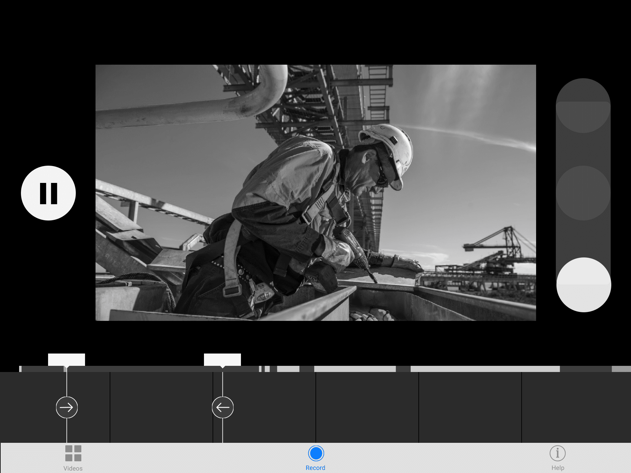
Pause When paused, the worker can go on to save, go back to the last recording, or start over.
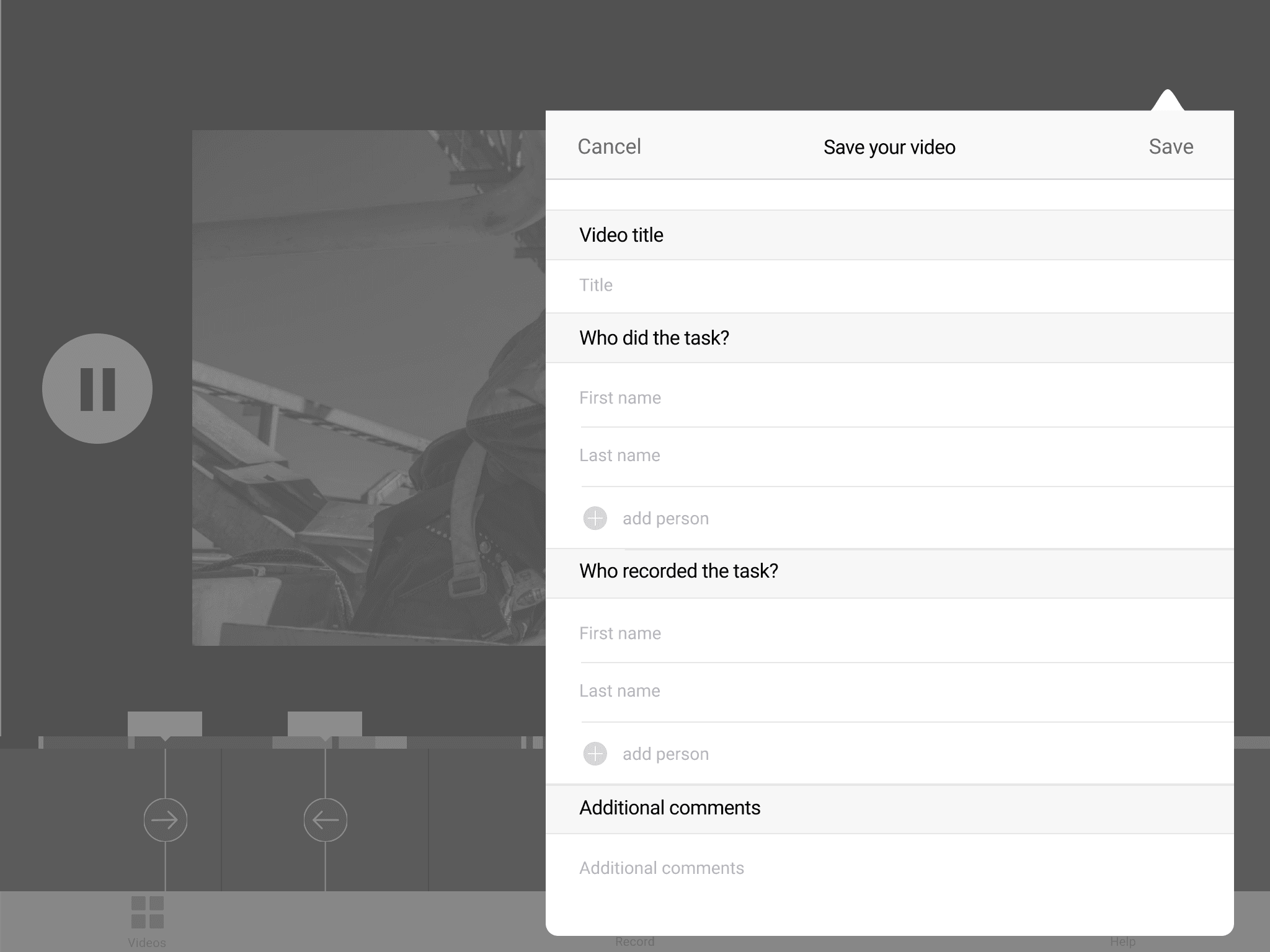
Save The save form asks for a title, who to tag, and any comments.
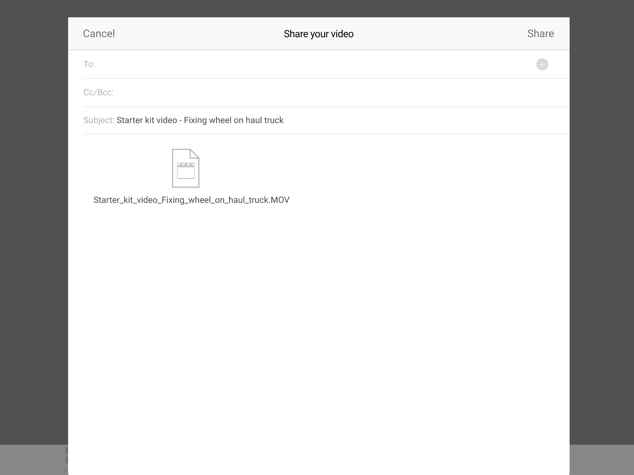
Share The worker enters an email and shares the video, and a pop up confirms “Your video has been shared”.
I drew the wireframes, and the team's visual designer designed the UI on top of them.
How Doers received the concepts in testing
A simpler structure and layout, built around the task
We simplified the information architecture and page layout to put the task first, and Doers responded very positively to the concepts in testing. The design also let workers report issues with the work instructions, and targeted content to what each user needed.
We proposed very clean styling and simple, clear language, so the app would suit use over a full day and keep workers focused on the task.
The outcome
Outcome
Two apps, from research to site in sixteen weeks
The program ran for sixteen weeks. We spent four weeks on definition and design, then twelve weeks building. Each app was delivered as an MVP, a first working version, and tested on site during a shutdown.
The Starter Kit gave workers a faster way to report waste in their work and suggest a better way to do it.
- from kickoff to two MVPs
- 16 weeks
from kickoff to two MVPs
- less training time for workers
- 20%
less training time for workers
- user satisfaction among workers
- 90%
user satisfaction among workers