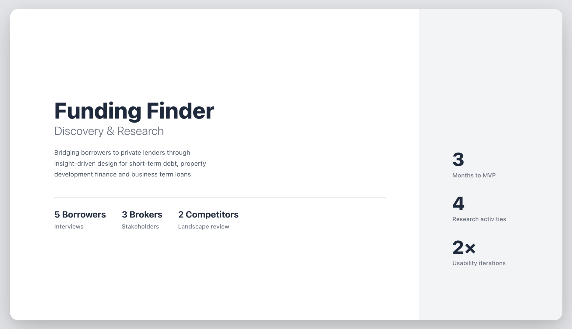
Funding Finder
Turning a paper-heavy process into a guided, intelligent match
Impact area
Financial access
My role
End-to-end UX design from discovery through delivery
User and stakeholder research
Information architecture and content strategy
UI design across borrower and broker lender experiences
Overview
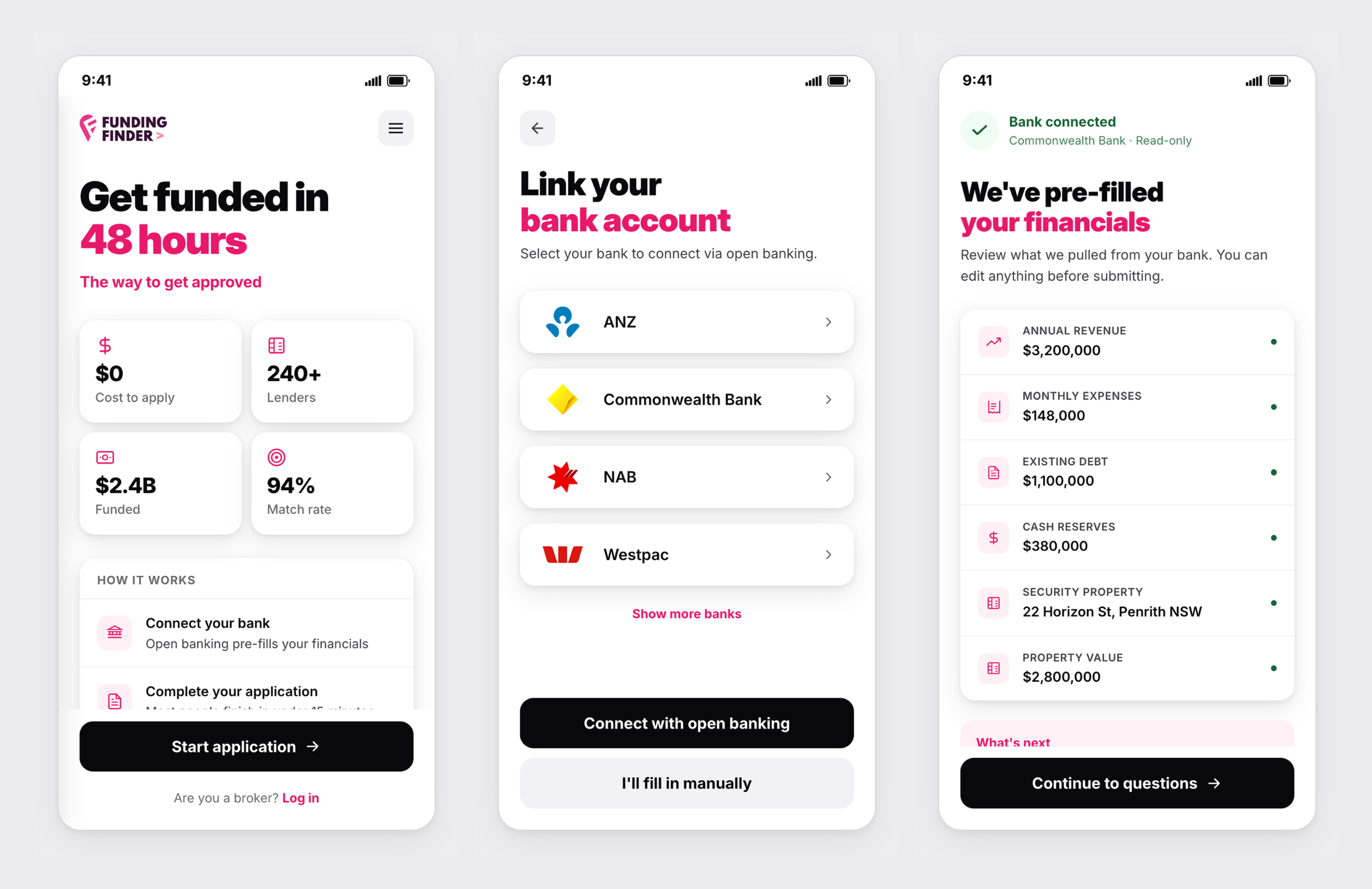
Funding Finder is a loan matching platform connecting borrowers with private lenders across short-term debt, property development finance, and business term loans.
The goal was to replace a fragmented, document-heavy process with a guided, intelligent experience.
We aimed to reduce friction for borrowers, streamline coordination for brokers, and ensure lenders receive complete, well-matched submissions from the start.
The challenge
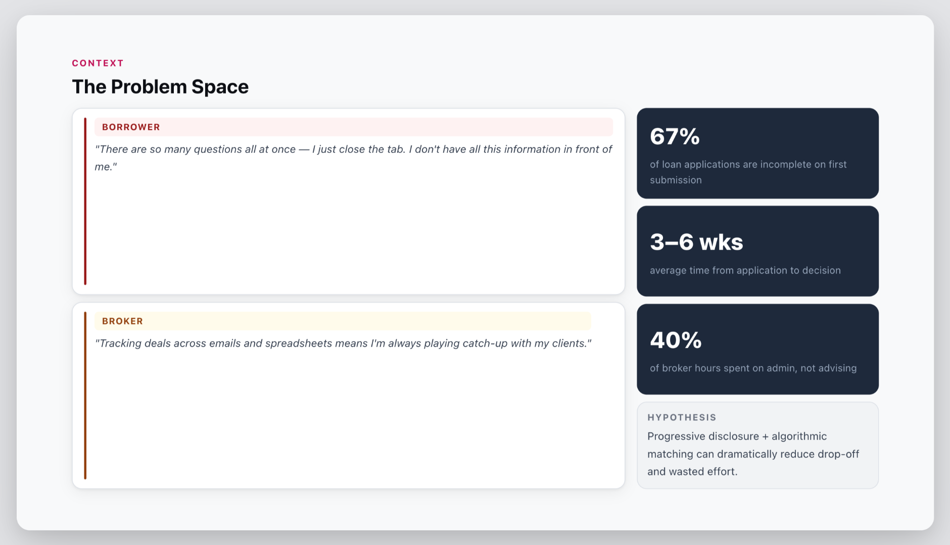
Loan applications are slow, manual and opaque for everyone involved.
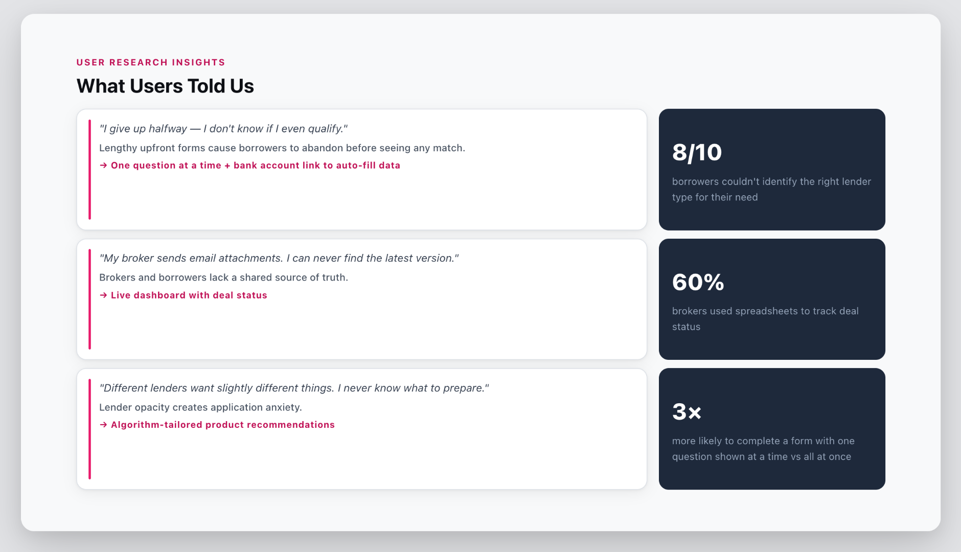
67% of applications are incomplete on first submission. The average time from application to decision is 3–6 weeks. And 40% of broker hours are spent on admin rather than advising clients.
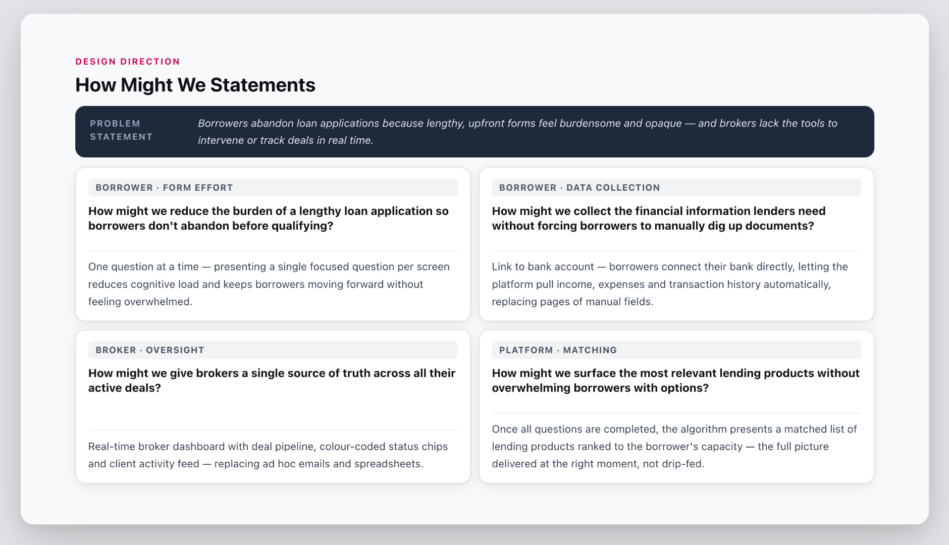
For borrowers, a lengthy upfront form is the first barrier. Without knowing whether they even qualify, many give up before finishing.
For brokers, the problem is one of coordination — tracking deals across emails and spreadsheets means constantly playing catch-up. For lenders, incomplete and mismatched submissions waste assessment time.
Success Metrics
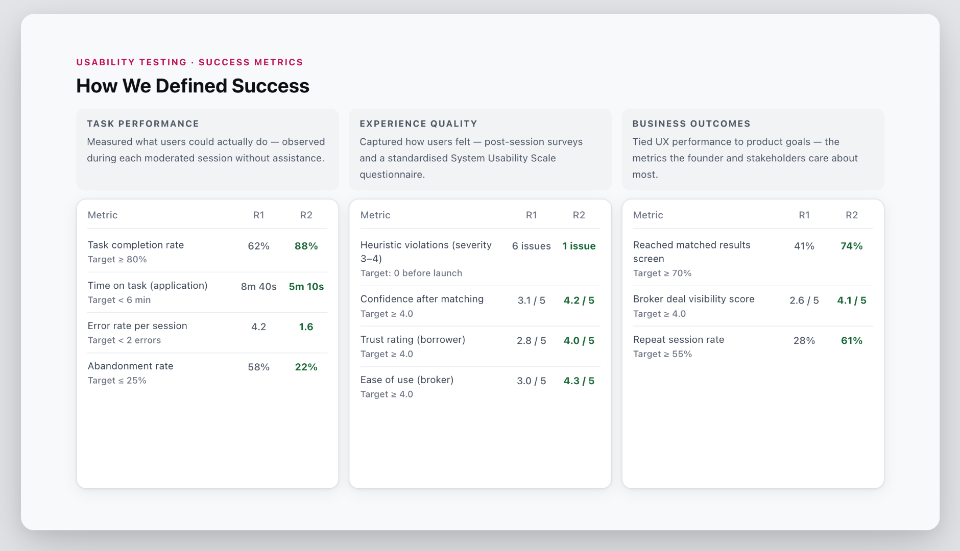
MVP delivery — designed, developed, and launched within three months and under budget, with two rounds of usability testing informing iterations before and after launch
Form completion — borrowers complete the loan application without dropping off, targeting above 70% task success rate
Time to apply — bank account linking reduces time spent on financial questions compared to manual entry
Matching accuracy — borrowers are matched with relevant loan products based on their answers
Broker efficiency — brokers can track and manage multiple deals without needing to chase status updates
Usability — no unresolved severity 3–4 issues identified before launch across two rounds of testing
Approach
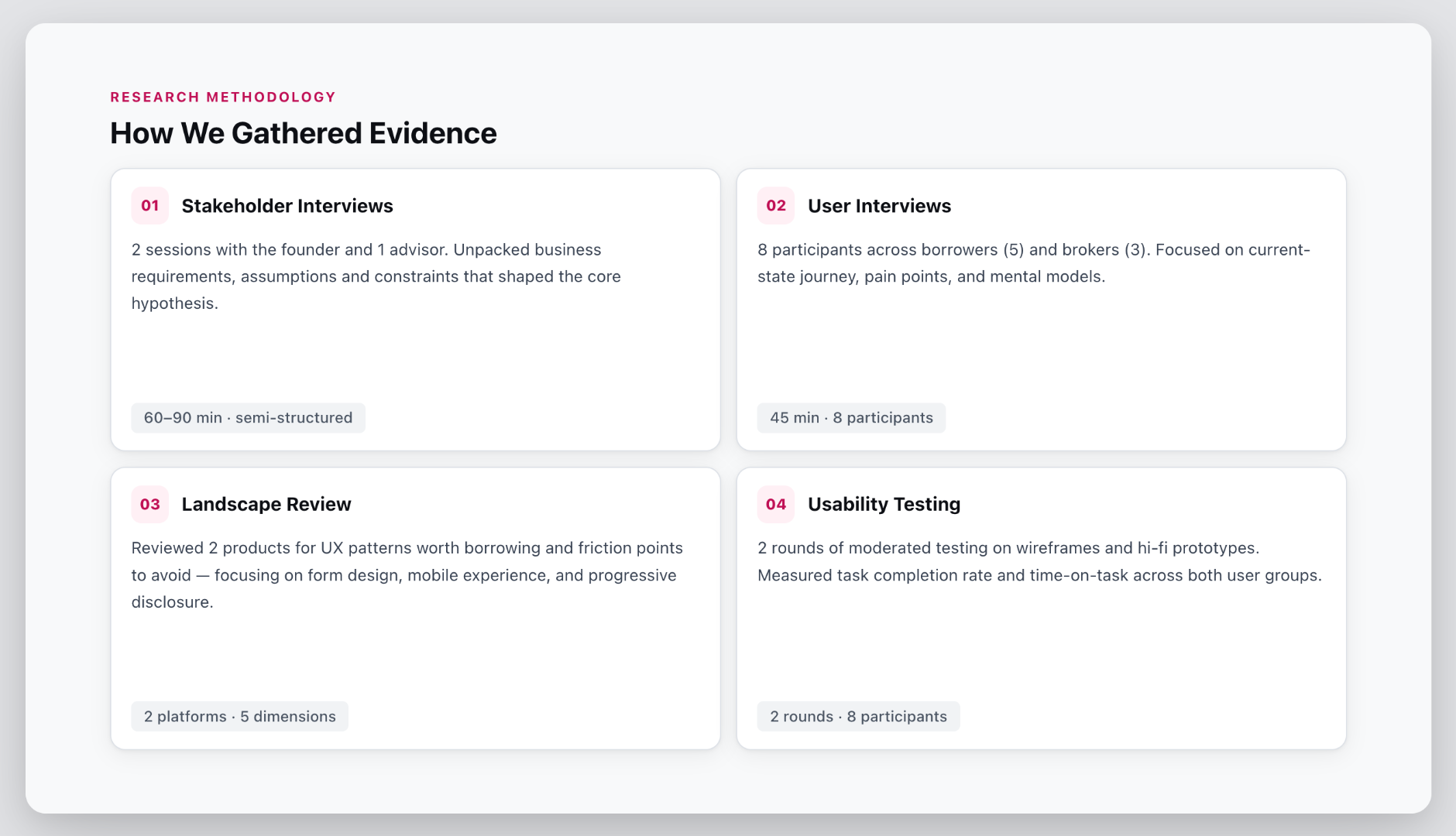
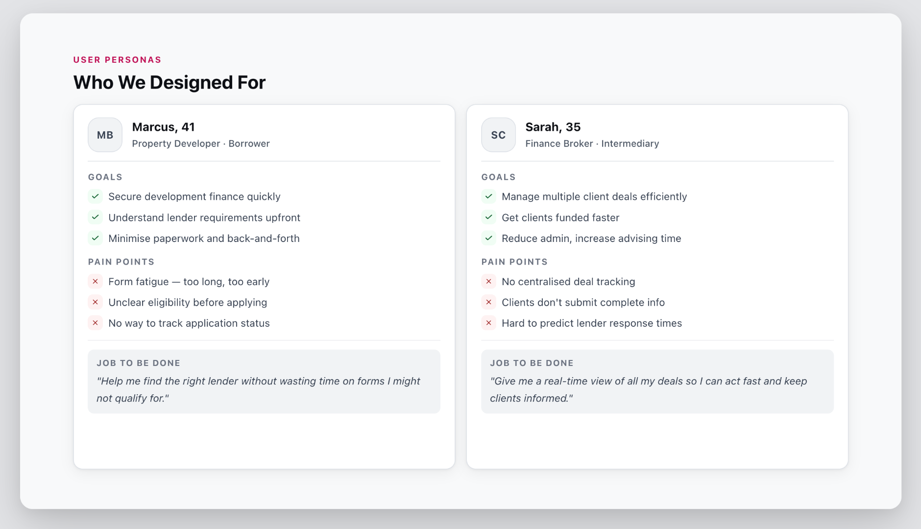
Stakeholder interviews with the founder and advisors to unpack business requirements and form the core hypothesis
User interviews across borrowers and brokers to understand pain points, journeys and mental models
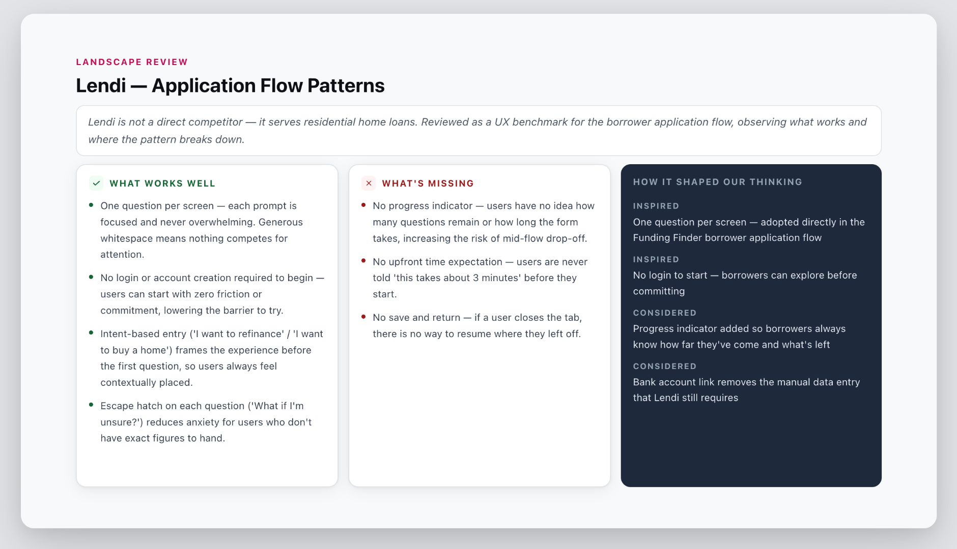
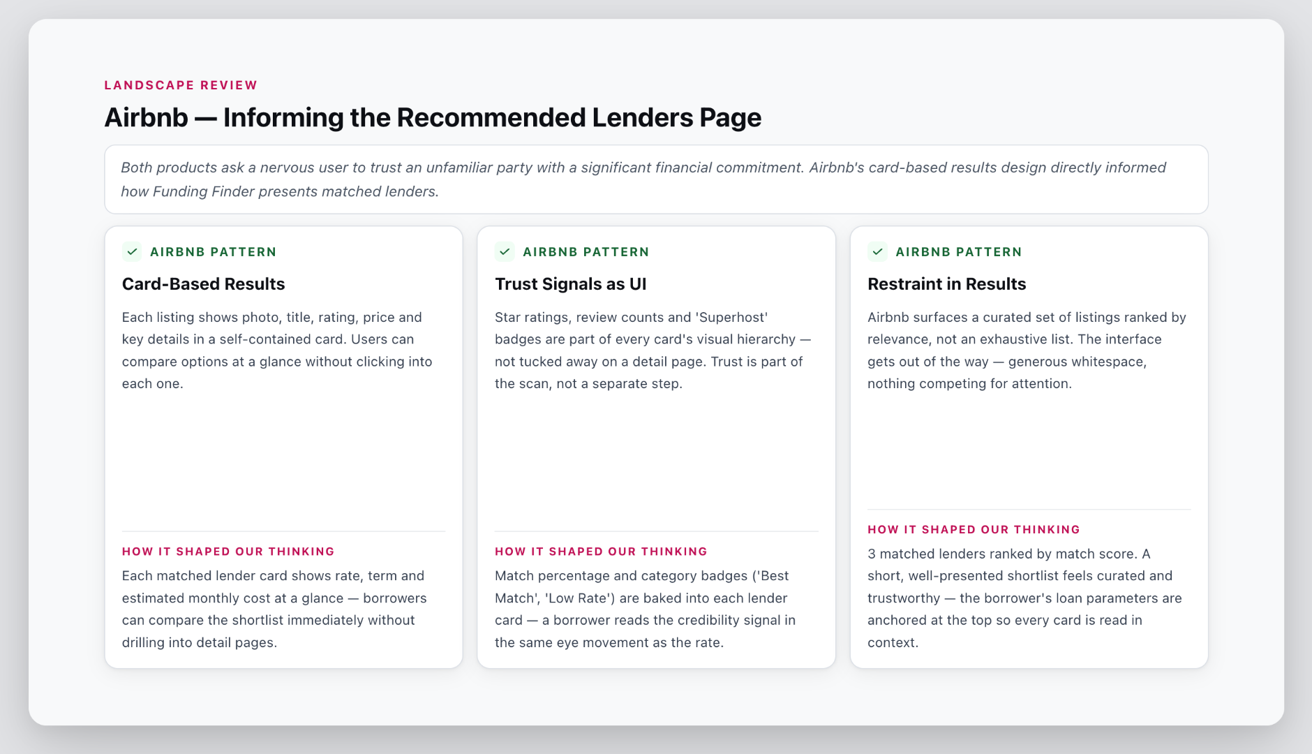
Landscape review to adopt ux patterns
Personas and task analysis to define distinct user needs and map system boundaries between admin and brokers
How Might We statements to frame design opportunities across borrower motivation, completion, broker oversight and matching
User journey and information architecture to gather feedback from cross-function team
Two rounds of moderated usability testing to validate and iterate
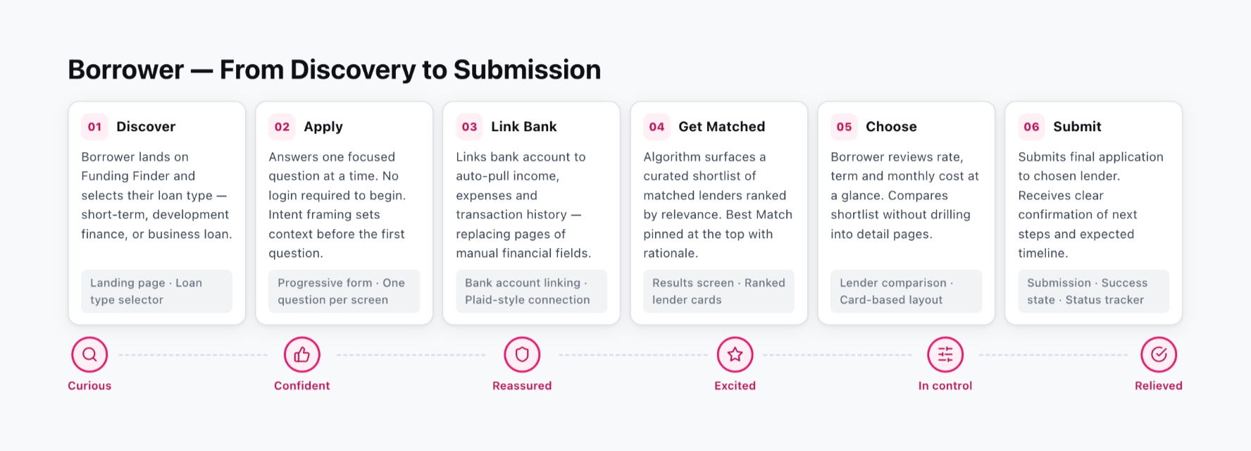
User journey - borrower
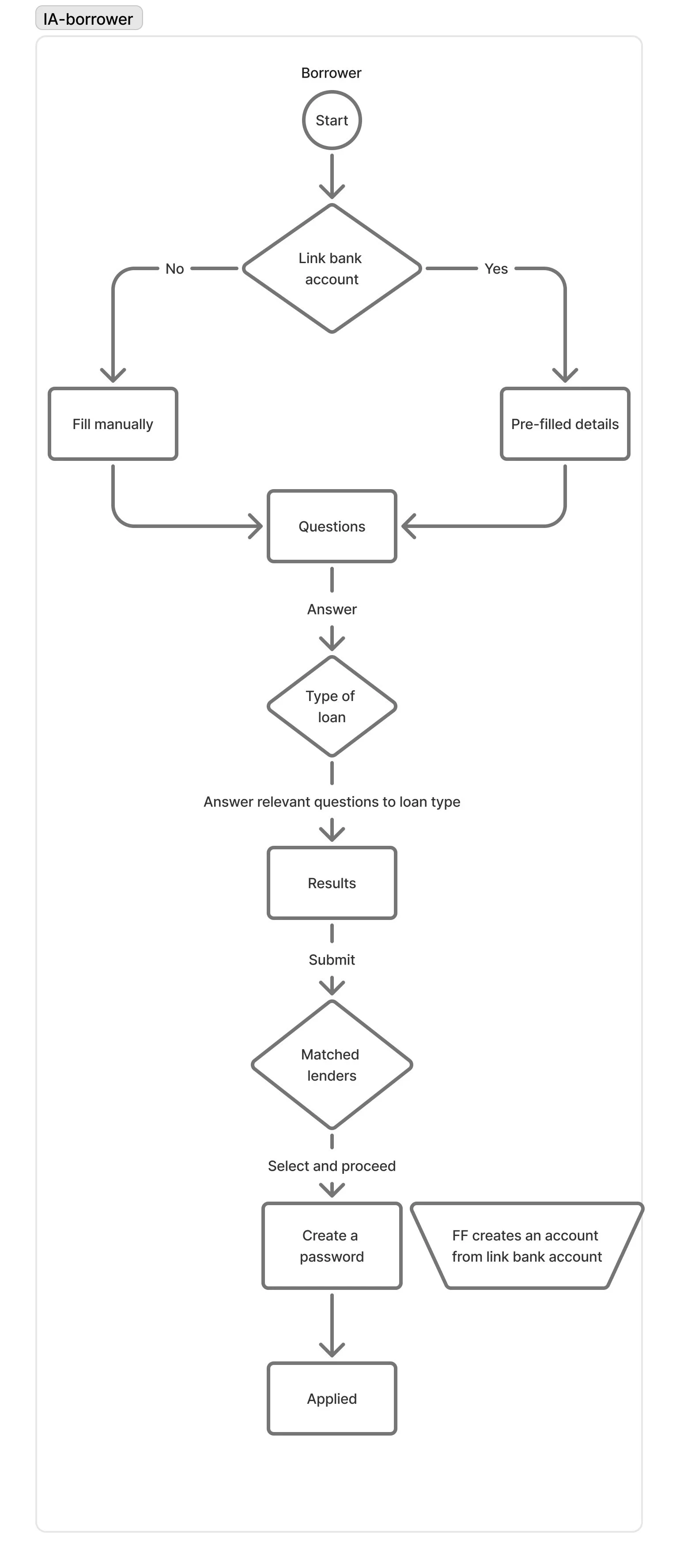
Information architecture - borrower
The IA was also used as a facilitation tool — shared with the cross-functional team early to pressure-test assumptions, surface edge cases and get engineering, product and business aligned before a single screen was designed.
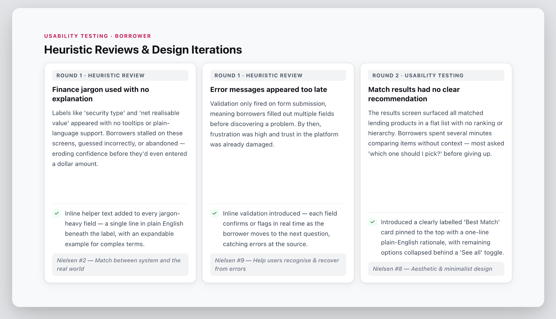
By the end, borrowers know exactly who to go with and why.
Microcopy as a trust signal
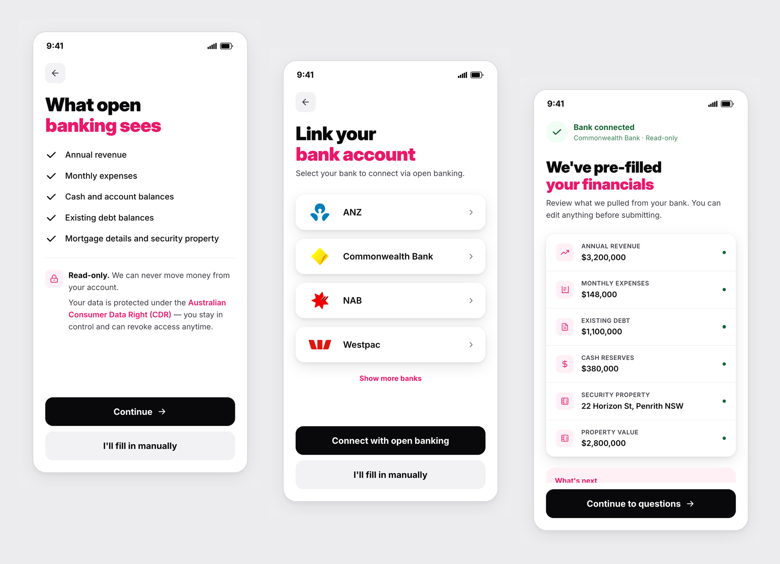
Borrowers connecting a bank account worry about one thing: loss of control.
I designed the consent screen copy to address that directly:-
read-only access
no ability to move funds
data protected under the Australian Consumer Data Right
access can be revoked anytime
Usability testing showed this single screen significantly increased trust and conversion.
Reduce drop-off rate
Bank account linking pre-fills financial data automatically, cutting the form down significantly
A single question at a time keeps borrowers focused — no wall of fields that would overwhelm
A/B testing shows borrowers are 3× more likely to complete
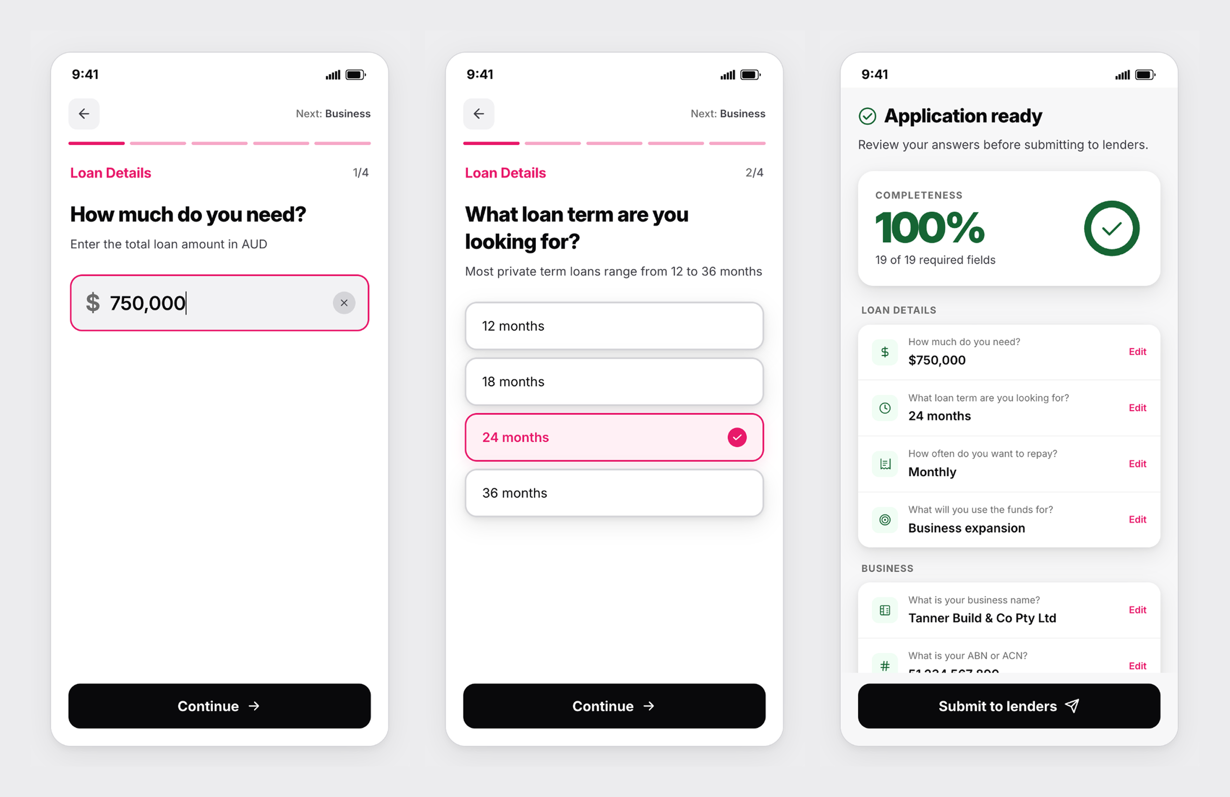
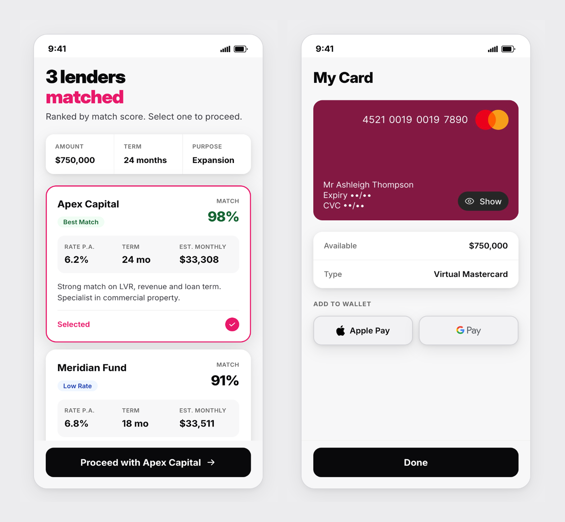
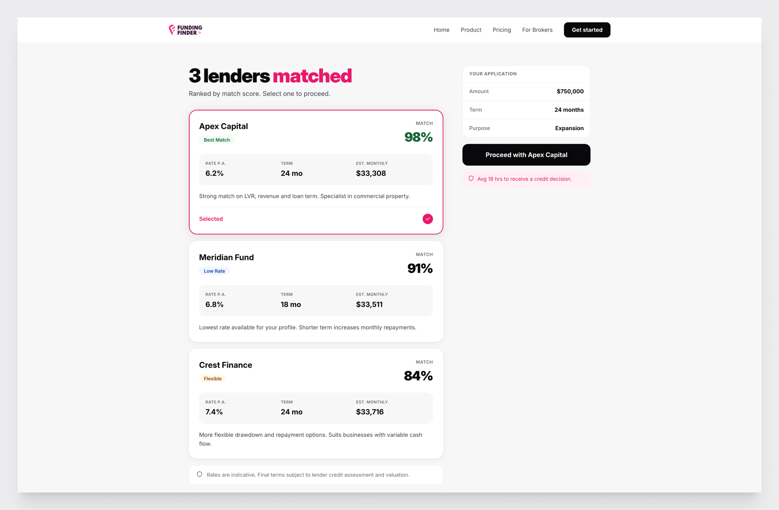
Surfacing a clear recommendation
Best Match card pinned to the top with a one-line plain-English rationale
Each card shows rate, term and match score so borrowers can self-validate
Closing the gap between approval and funds
A key design question was how to close the gap between approval and access to funds. Virtual card disbursement via lenders' existing Mastercard programs emerged as a promising direction worth exploring.
Large screen view
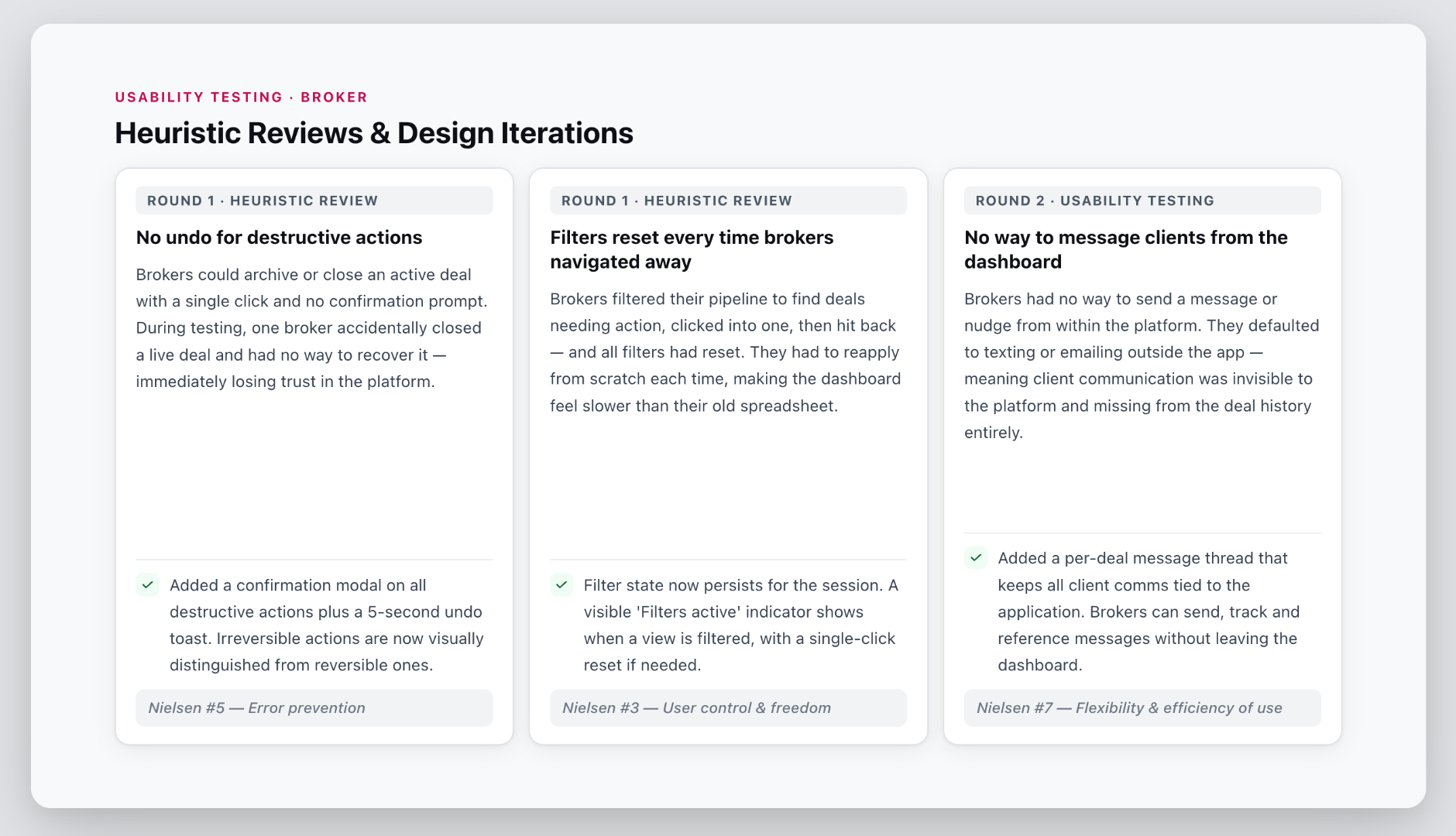
Heuristic reviews and design iterations - borrower
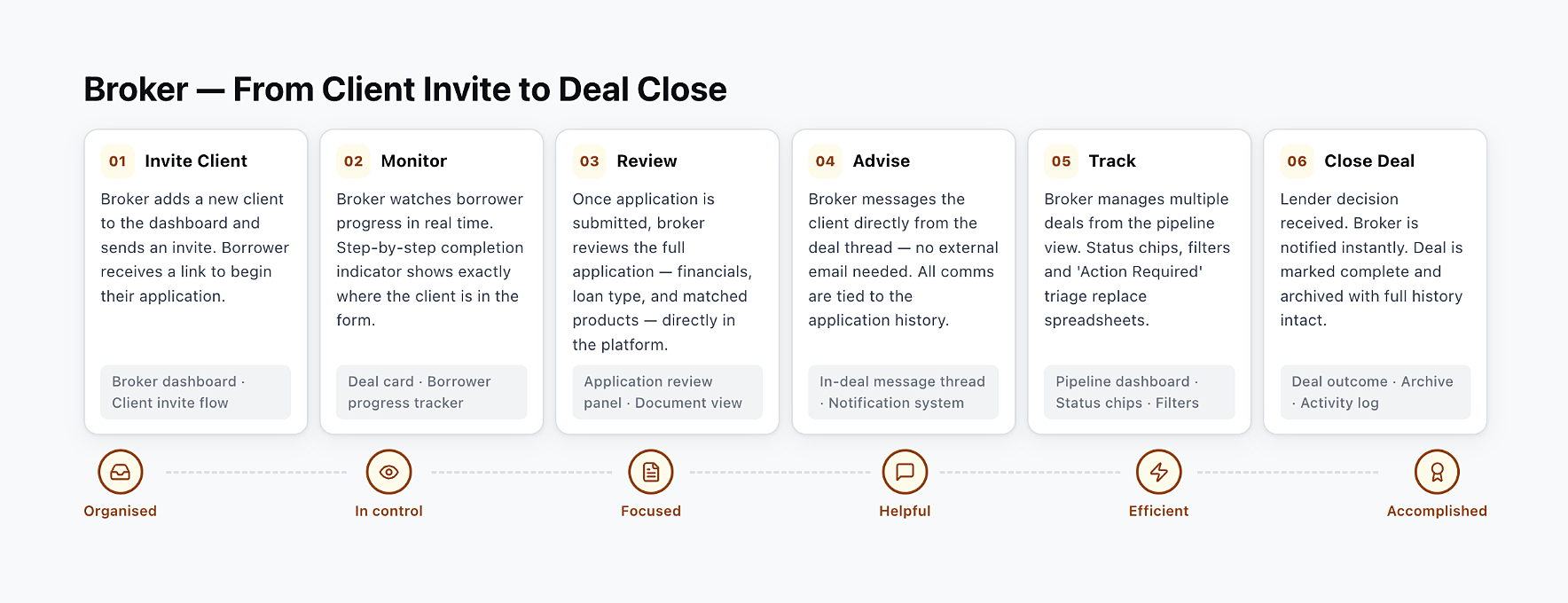
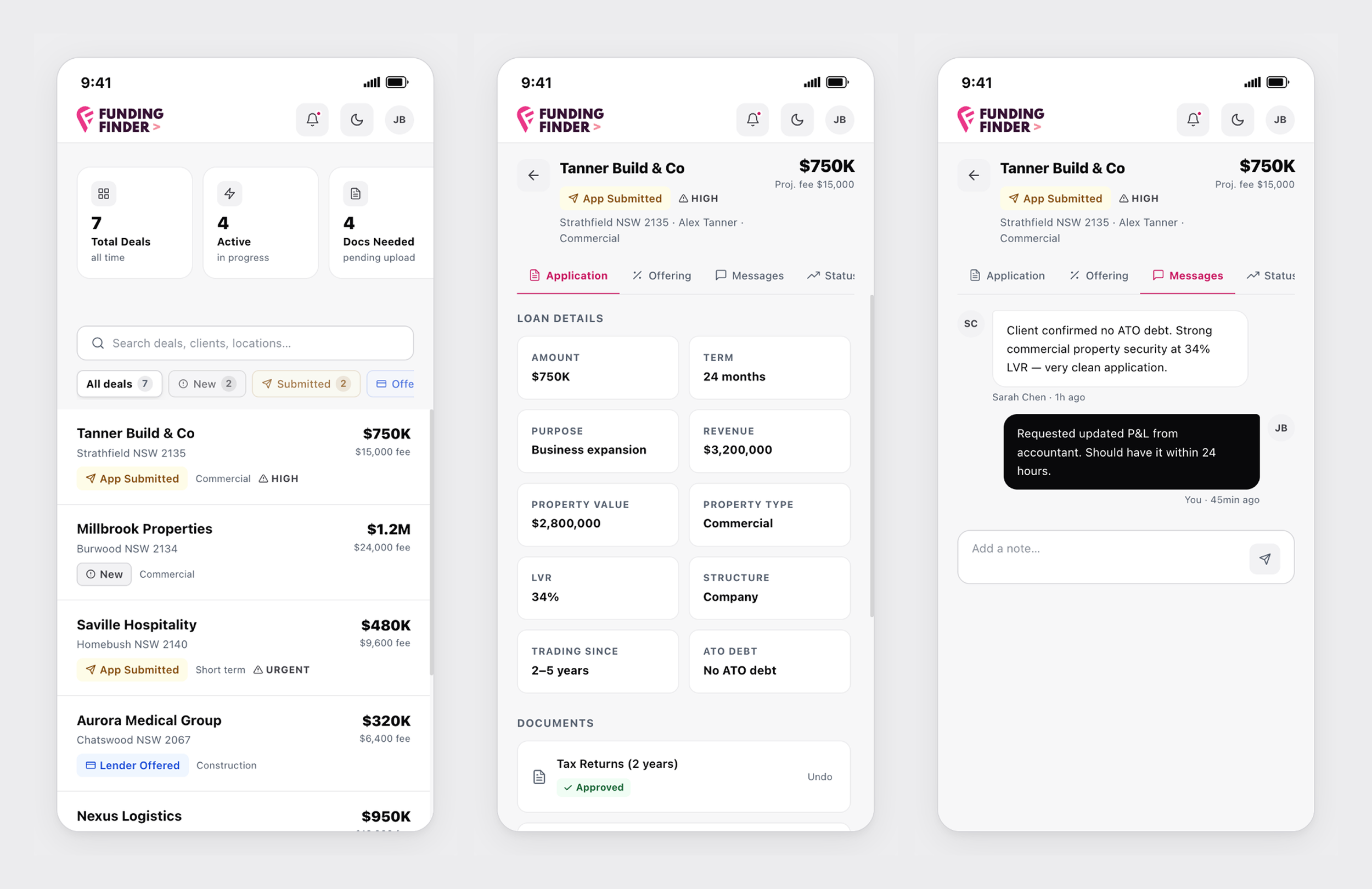
Broker Dashboard
A dashboard was designed with the brokers in mind, assisting them to manage and track multiple deals’ status, review an application in order to assist their clients.
It replaced ad hoc emails and spreadsheets with a single source of truth — a live pipeline, client activity feed and communication as well as clear visibility of next steps.
User journey - broker
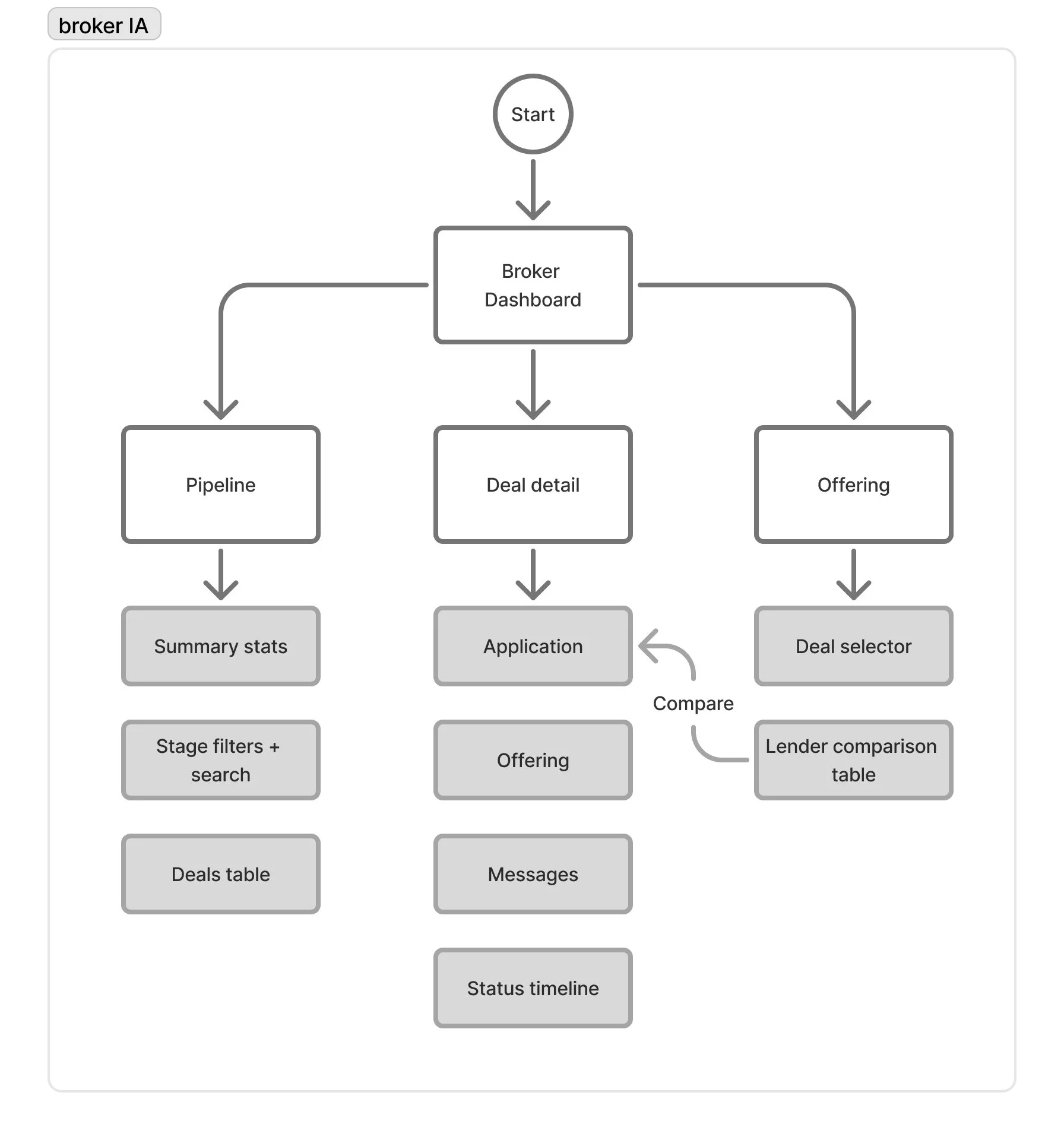
Information architecture
Mapped out what brokers need to see at a glance vs. what they need to dig into
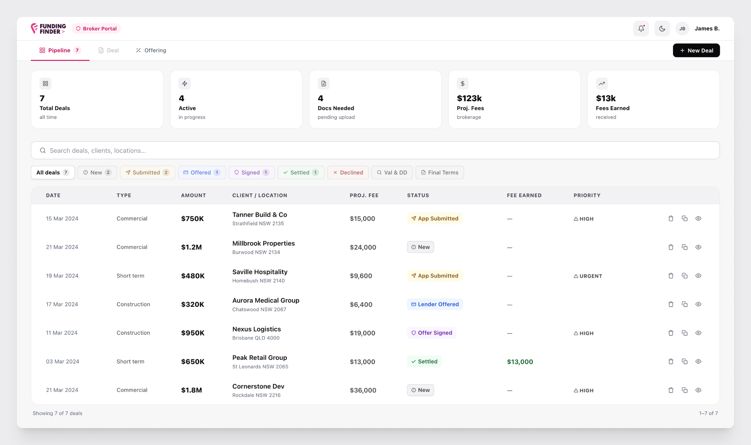
Pipeline as the home — every deal, every stage, one place
Drill into a deal to find the application, lender comparison, messages and status timeline
Replacing chaos with clarity
Show clearly which applications required documents
Deal table designed for speed — application stage, amount, fee and priority
Colour-coded stage badges with icons so status lands instantly
Staying in the loop without leaving the app
Brokers can message borrowers directly from within the deal — no more chasing via email
Notes and updates are threaded against the deal, so context is never lost
Stage changes are tracked in a live timeline, so both broker and borrower always know where things stand and what happens next
Heuristic reviews and design iterations - broker
Achievements
Shipped in three months. On time and under budget.
MVP launched within three months and under budget
The progressive matching algorithm successfully guided borrowers to relevant lending products without surfacing options that didn't suit their situation
By end of usability testing, borrowers could confidently identify the right lender type for their needs.
The broker dashboard tested strongly for oversight and control — brokers could immediately locate deal status, review client applications and identify what needed action