Healthdirect Symptom Checker
Making AI health triage accessible and actionable
Overview
Healthdirect is Australia's government-funded health information service, reaching millions of Australians across digital and phone channels.
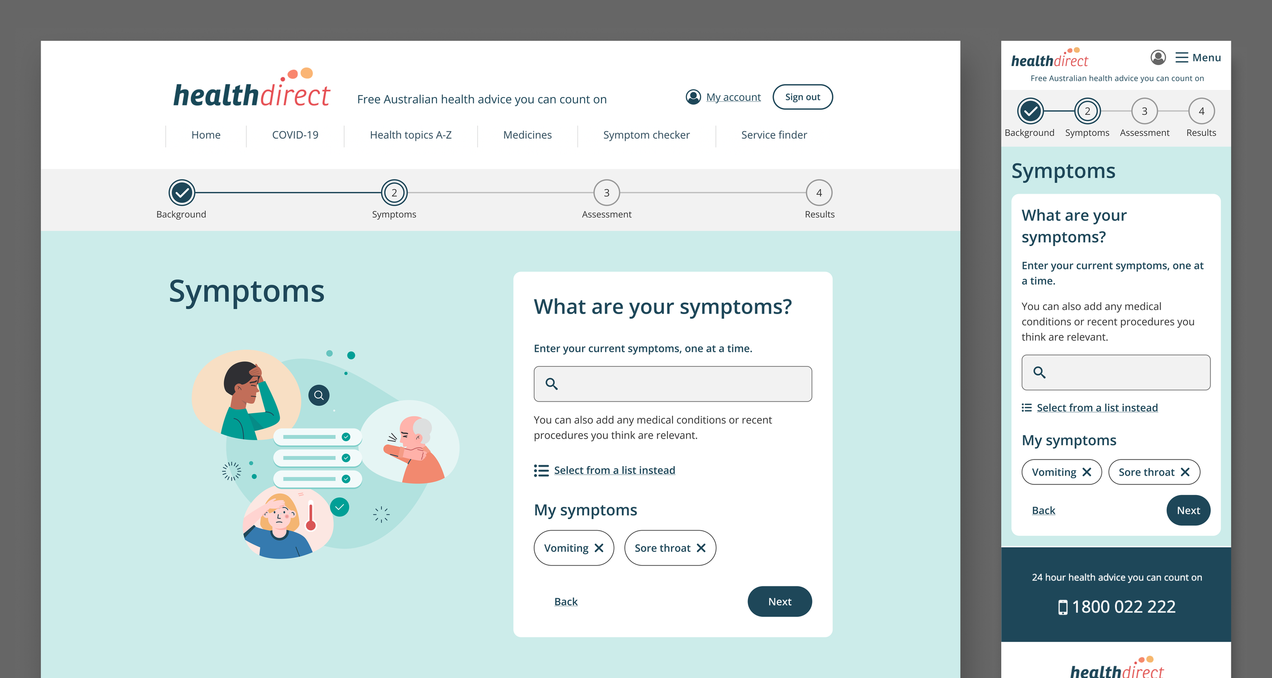
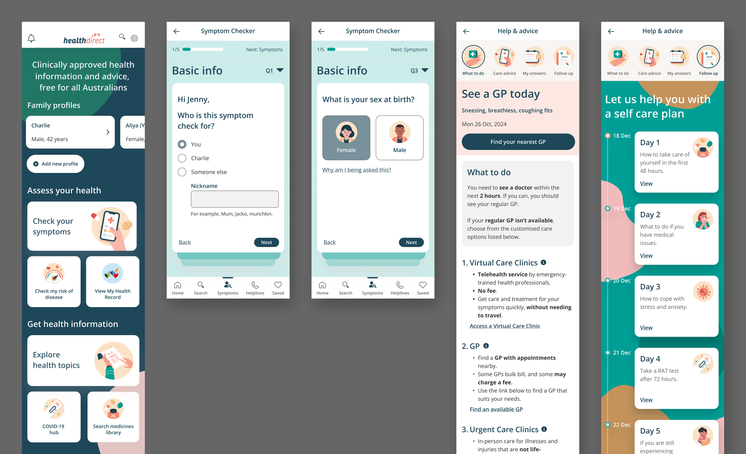
This project was a full redesign of their legal product, Symptom Checker — a triage tool used to help people assess their symptoms and decide on next steps for care.
Working across a cross-functional team, I led UX across two phases: a product redesign integrating Infermedica's AI engine, followed by a broader CX and service design initiative across Healthdirect's ecosystem.
Impact area
Public health
My Role
Phase 1
End-to-end UX design from light discovery through delivery
Content strategy and accessibility compliance
Information architecture and UI design
Stakeholder alignment and cross-functional facilitation
Phase 2
Consumer research and qualitative synthesis
Service design and ecosystem mapping
Concept prototyping to inform strategic decisions
The challenge
Healthdirect's Symptom Checker had a completion rate of just 45% — users were dropping off before getting the care guidance they needed.
The challenge was to redesign the experience around a new AI triage engine (Infermedica) while navigating Australia's strict clinical standards, legal constraints, and Healthdirect's non-diagnostic role.
Success Metrics
Completion rate — increase from 45% baseline toward the 60–70% industry benchmark for complex digital health tools
Usability — achieve 78%+ task success rate and resolve all severity 3–4 issues before launch.
Drop-off rate — no single step loses more than 20% of users
Health literacy — users can understand medical terms and instructions without assistance
Accessibility — meet WCAG 2.1 AA compliance
User confidence — users feel guided and supported throughout the assessment
PHASE 1
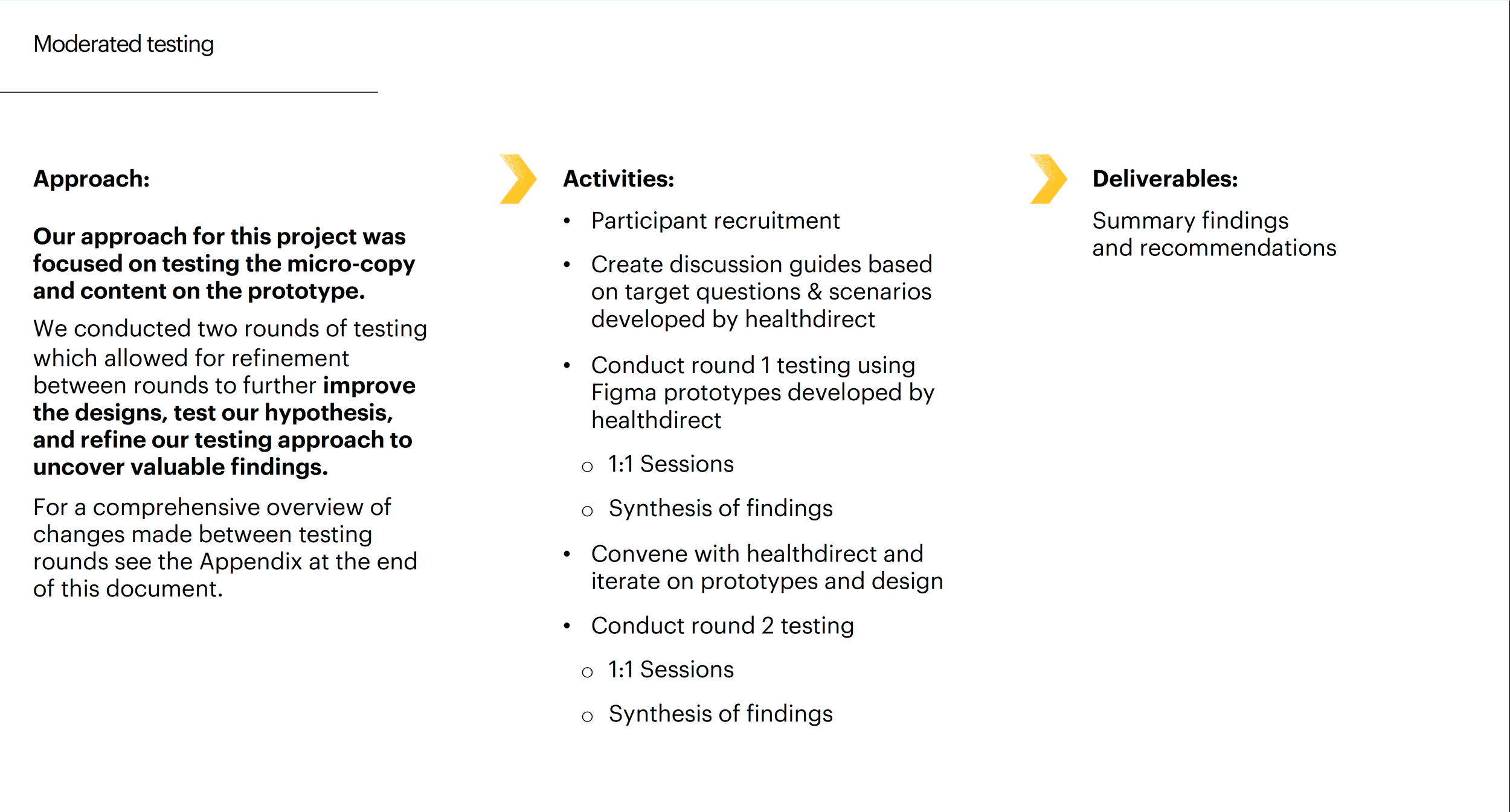
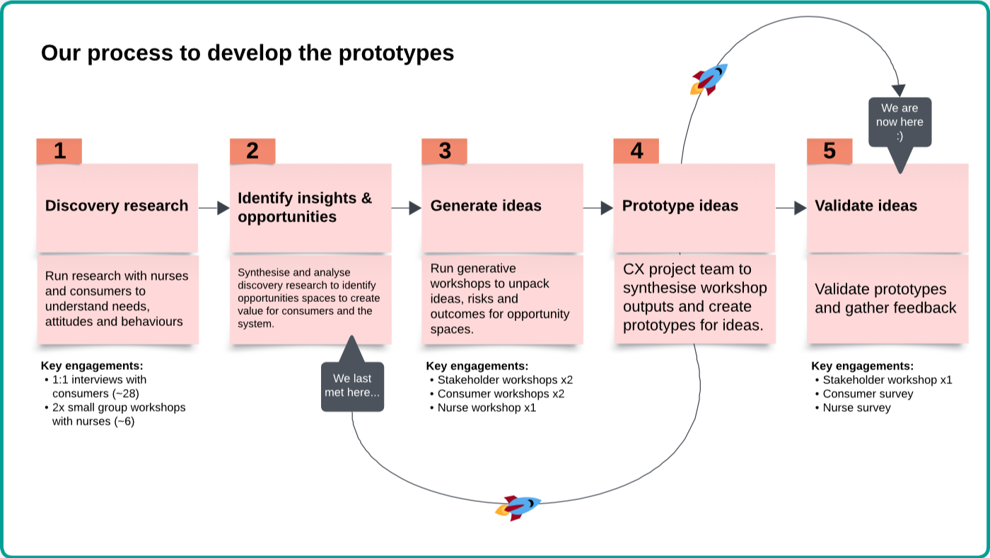
Approach
Applied existing user research to inform design
Adhered to government policies and clinical standards
Audited Infermedica AI’s capabilities
Conducted landscape review of health products
User journey and IA to identify gaps
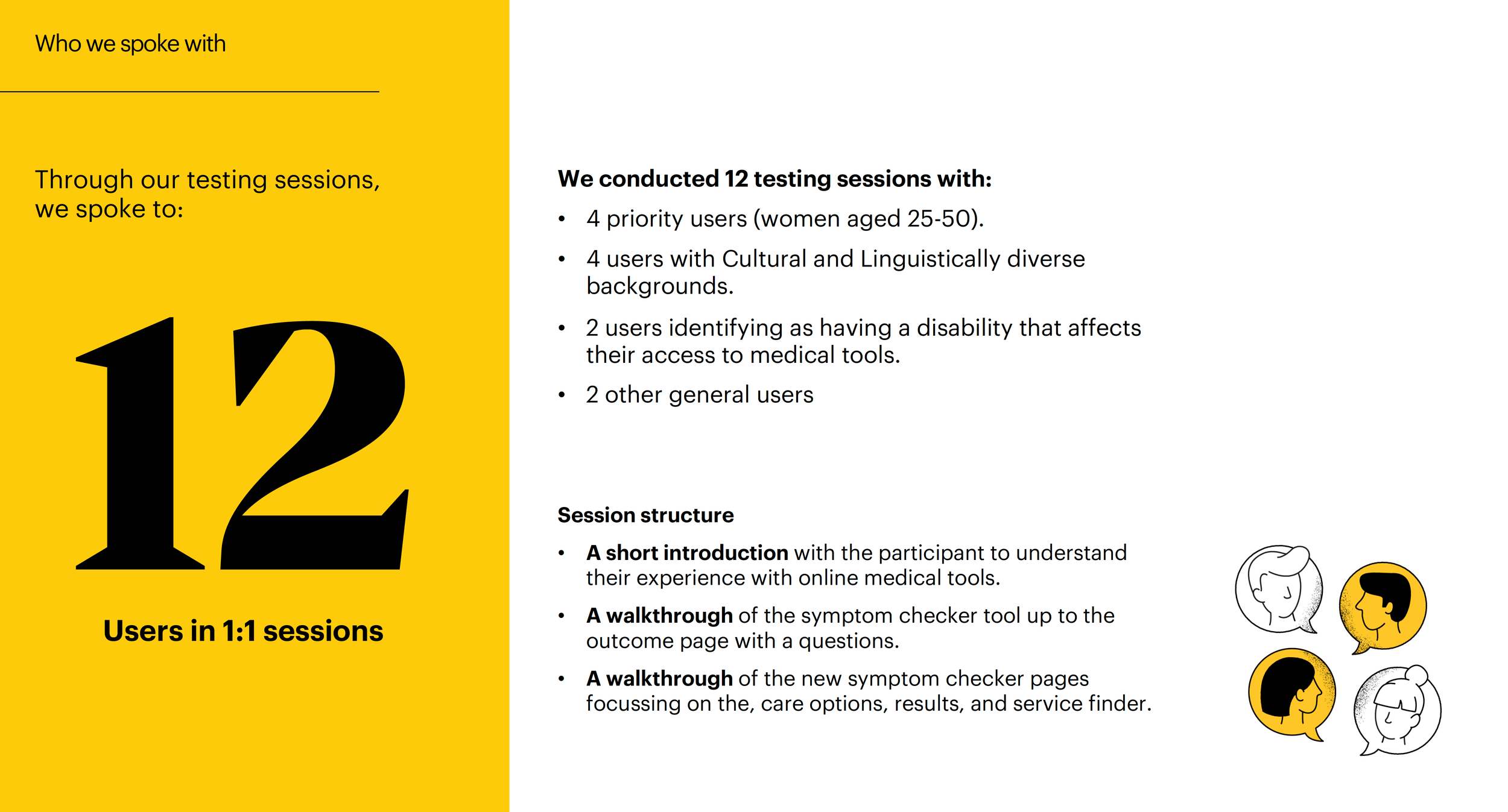
Ran moderated usability tests with external agency
Low-fidelity concepts
Content strategy
Infermedica AI engine audit
Strong clinical reasoning with structured symptom assessment
Some outputs can sound diagnostic or overly certain without supervision
Recommendations need reframing for Australian clinical and policy context
Users need clearer signals on when to move from AI guidance to self-care or human support
User Journey
Landscape review
Information architecture
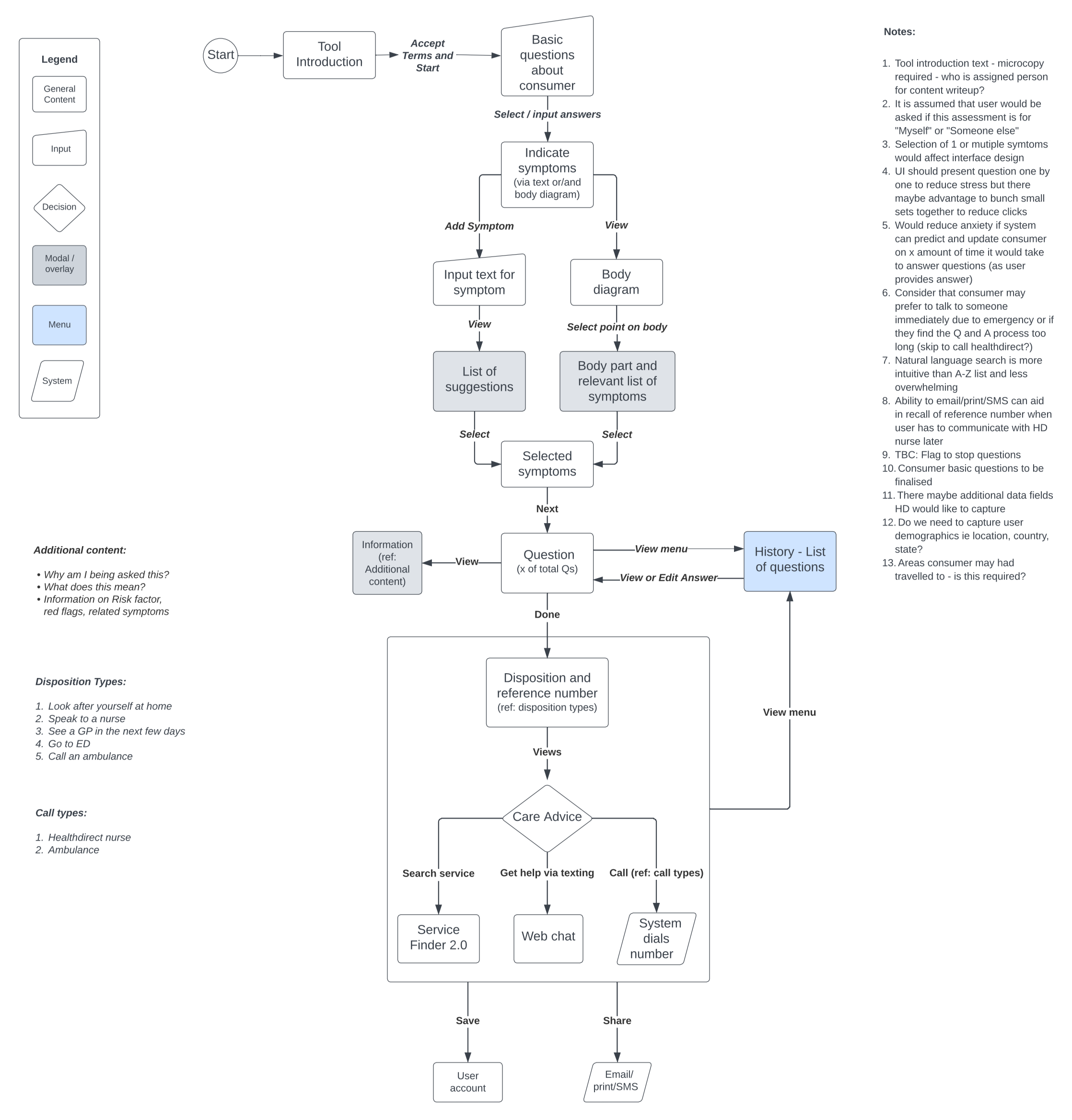
Low fidelity sketches


User testing microcopy and content

Accessibility
Conducted heuristic reviews to identify usability issues before resource-intensive testing
Tested with diverse users including people with disability and tech-wary individuals, iterating on UX and microcopy each round
Adhered to WCAG standards for screen reader compatibility and keyboard navigation
Applied soothing colour schemes sensitive to user emotions
Designed AI outputs to support decision-making without feeling directive

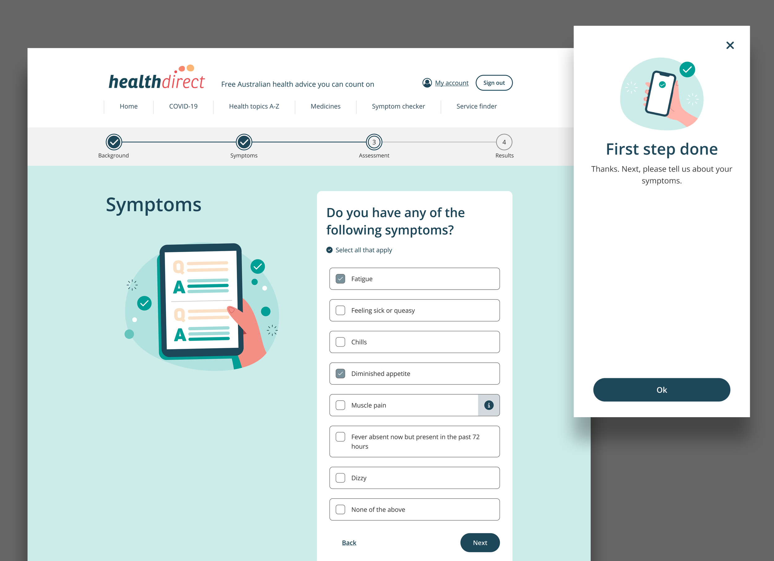
Keeping users motivated through a long assessment
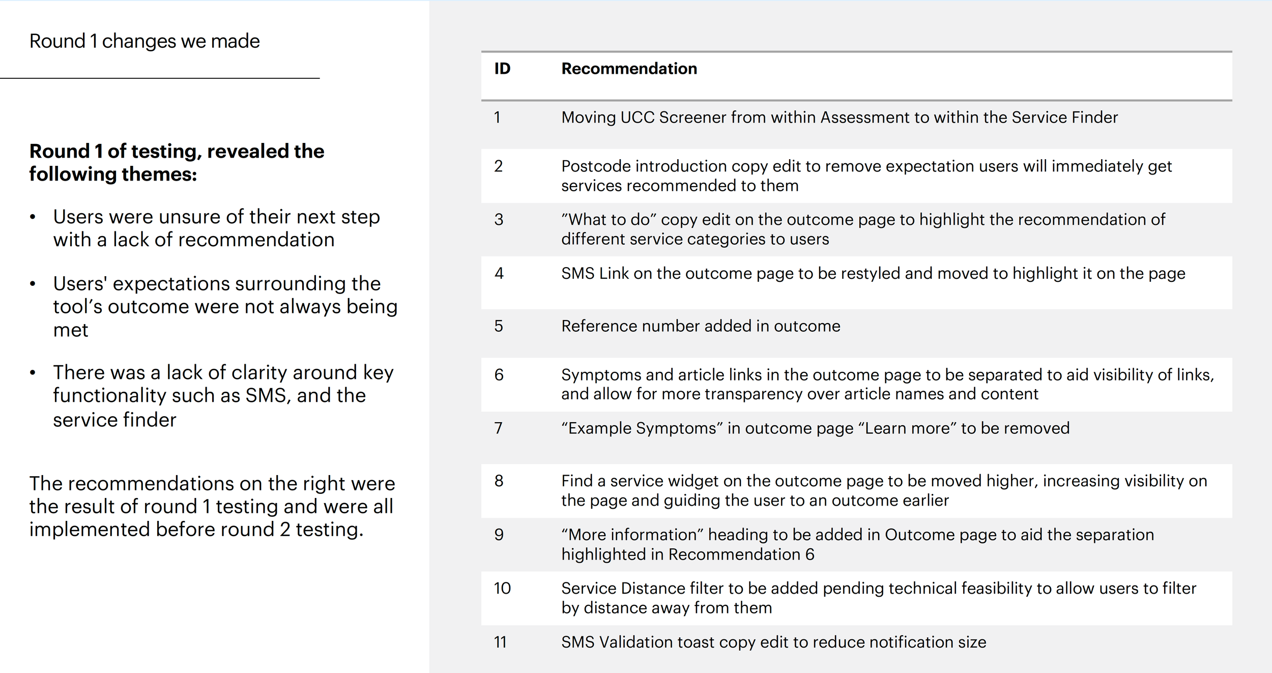
The usability testing revealed that the encouragement screen functioned as a good step in adding a human voice and propelling users to progress.
The steppers and clear instructions helped craft a supportive user experience and ease user anxiety.

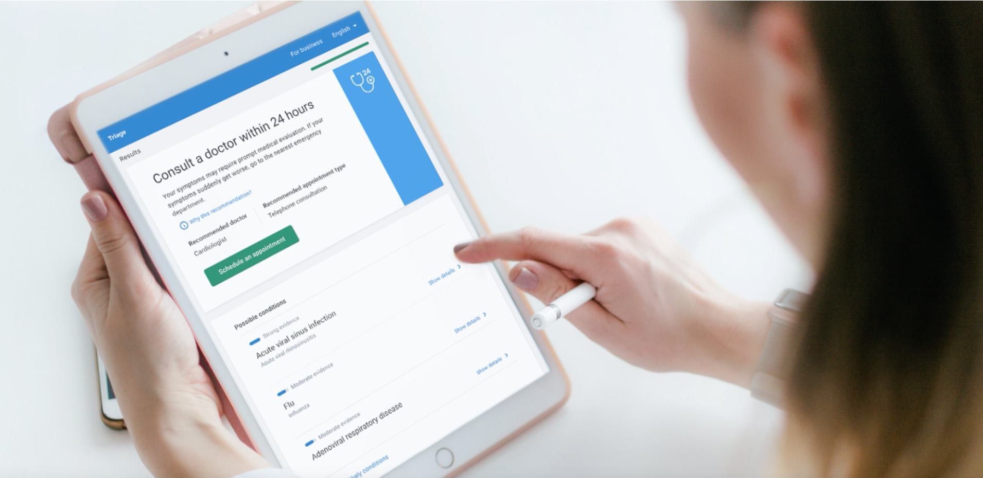
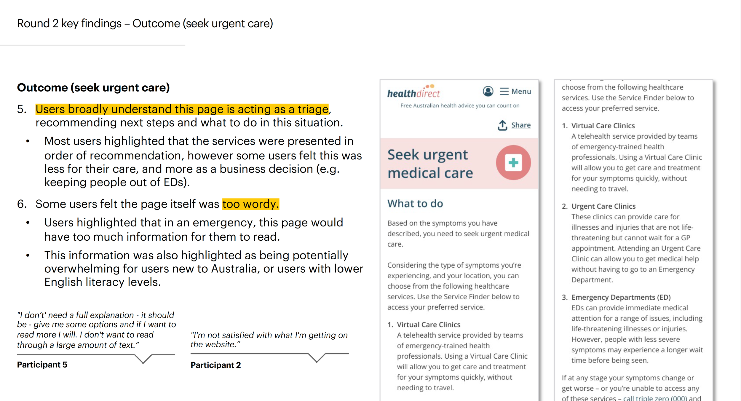
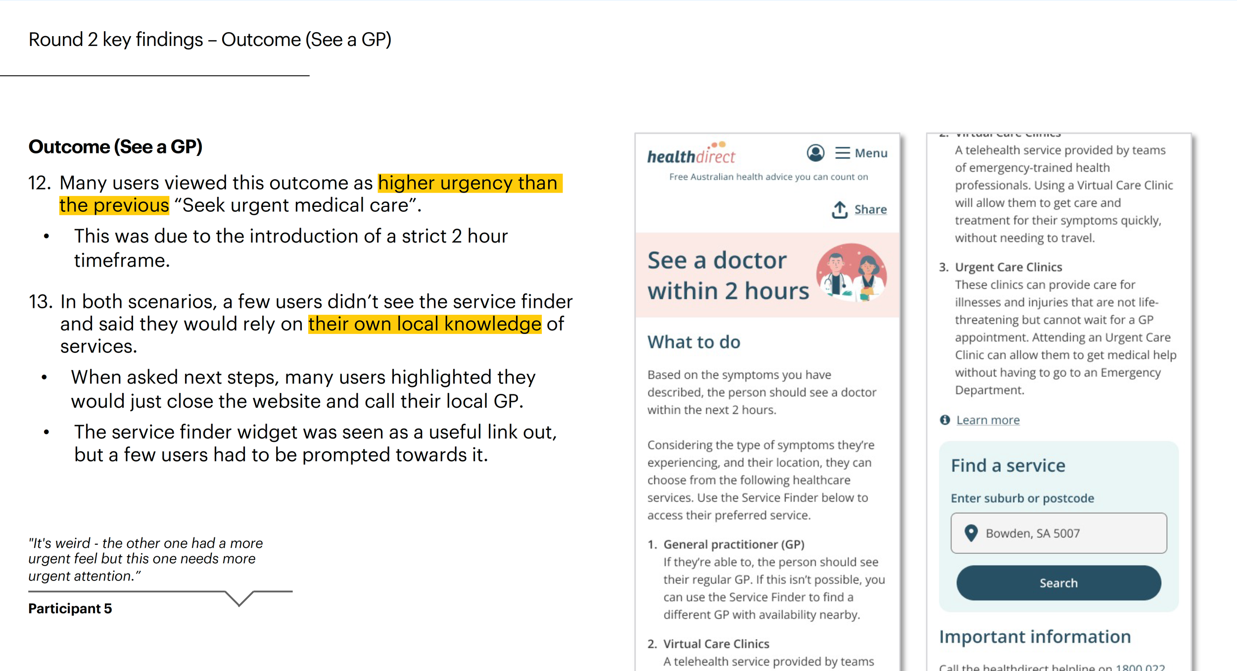
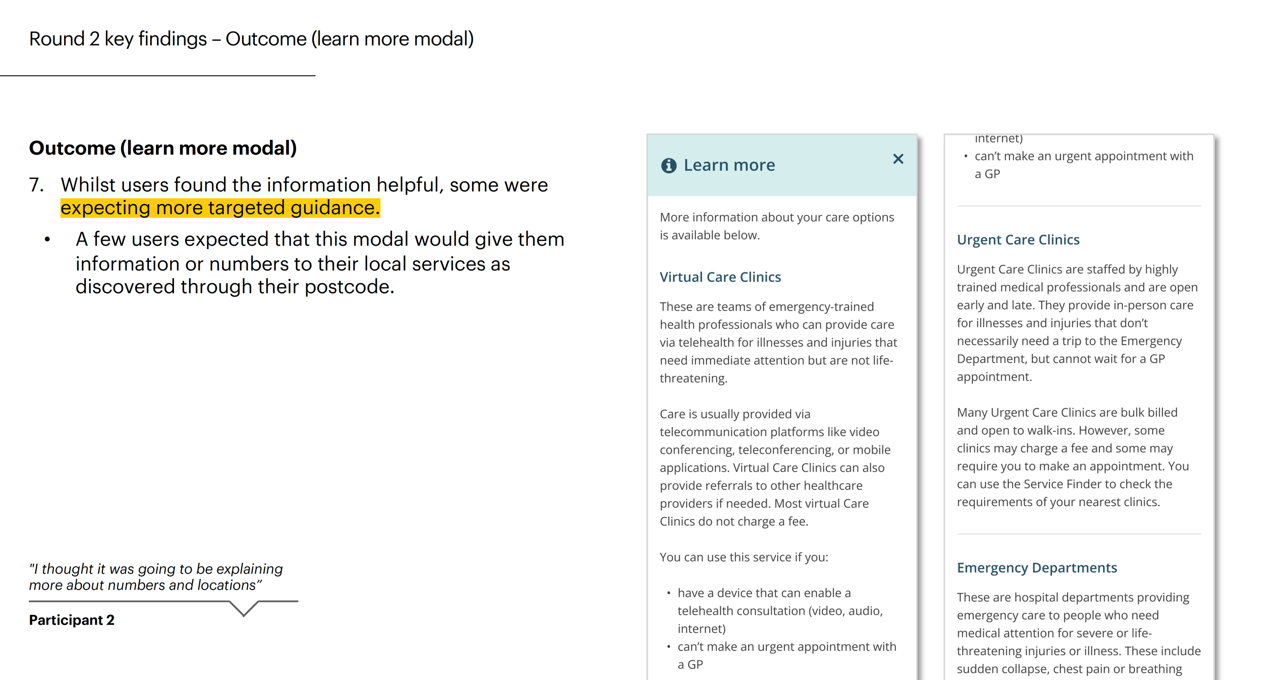
Actionable care advice
Surfaced key decision-making info — wait times, cost, and appointment requirements — to help users compare clinics
Numbered clinics in order of recommendation
Bolded key info for easy scanning
Highlighted essentials on service cards — "No fee", "Bulk Billing", distance to nearest clinic
Designing symptom checker in Healthdirect’s native app
The Symptom Checker was prototyped for Healthdirect's mobile native app as a future build, featuring an additional "Follow-up Care Plan" — a guided experience that helps users manage their symptoms at home.
As part of this work, I developed motion design prototypes to enhance user engagement and bring the interface to life. The concept was pitched to the business as a case for hiring a developer specialising in interactive animation.
Achievements
Increased user completion rates to 68% by the end of 2023, compared to the previous design’s average of 45%.
Further increased completion rates to 86.5% for the 2024 release.
Met high consumer demand for digital triage across jurisdictions in Australia
Facilitated workshops for workflow improvement and conflict resolution for cross-functional team, reducing project delays by approximately 20%
PHASE 2
Identifying Gaps and Opportunities Across a Complex Service System
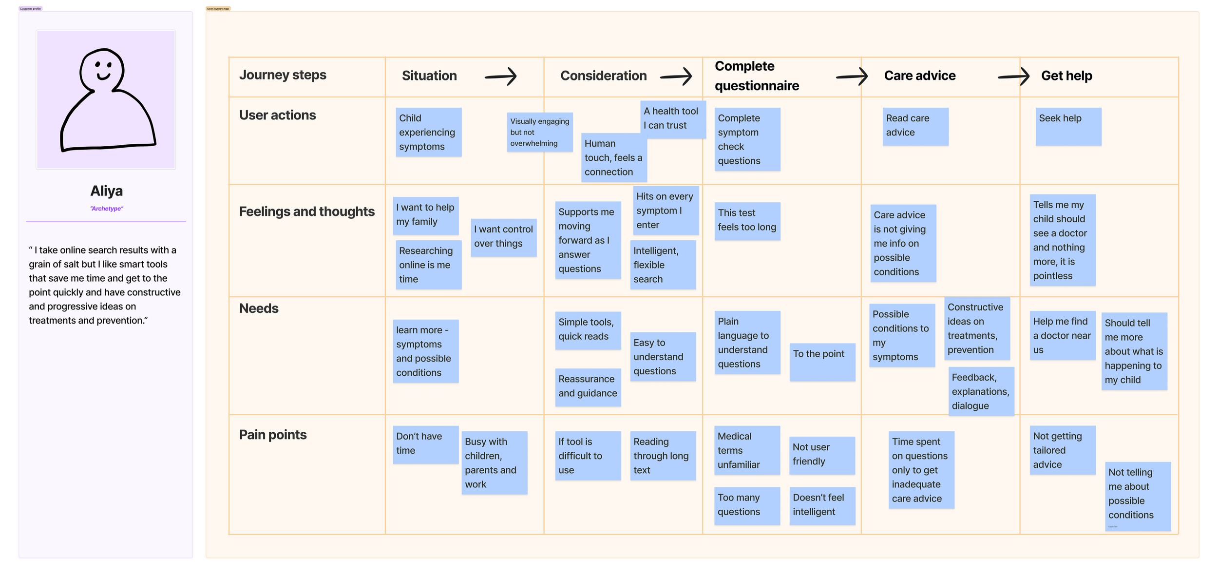
Following Phase 1 delivery, the Symptom Checker redesign became an input into a broader, time-boxed CX and service design initiative focused on understanding where gaps and opportunities existed across Healthdirect’s service ecosystem.
Rather than optimising a single product, Phase 2 stepped back to examine how people experienced digital services, GP advice, and nurse helplines together, particularly at moments of uncertainty when users were trying to understand what help was available and what to do next.
Our purposes
Identify system-level gaps between consumer needs, service intent, and actual behaviour
Surface future-state opportunities across services and channels
Use research and prototyping to inform strategic decisions and funding discussions
Explore how AI-assisted support could responsibly enhance human-led services
What I worked on
Working alongside CX leadership, I contributed by:
Conducting consumer interviews across prioritised cohorts
Synthesising qualitative insights to surface recurring patterns and moments of uncertainty
Translating insights into journey maps to make system gaps visible
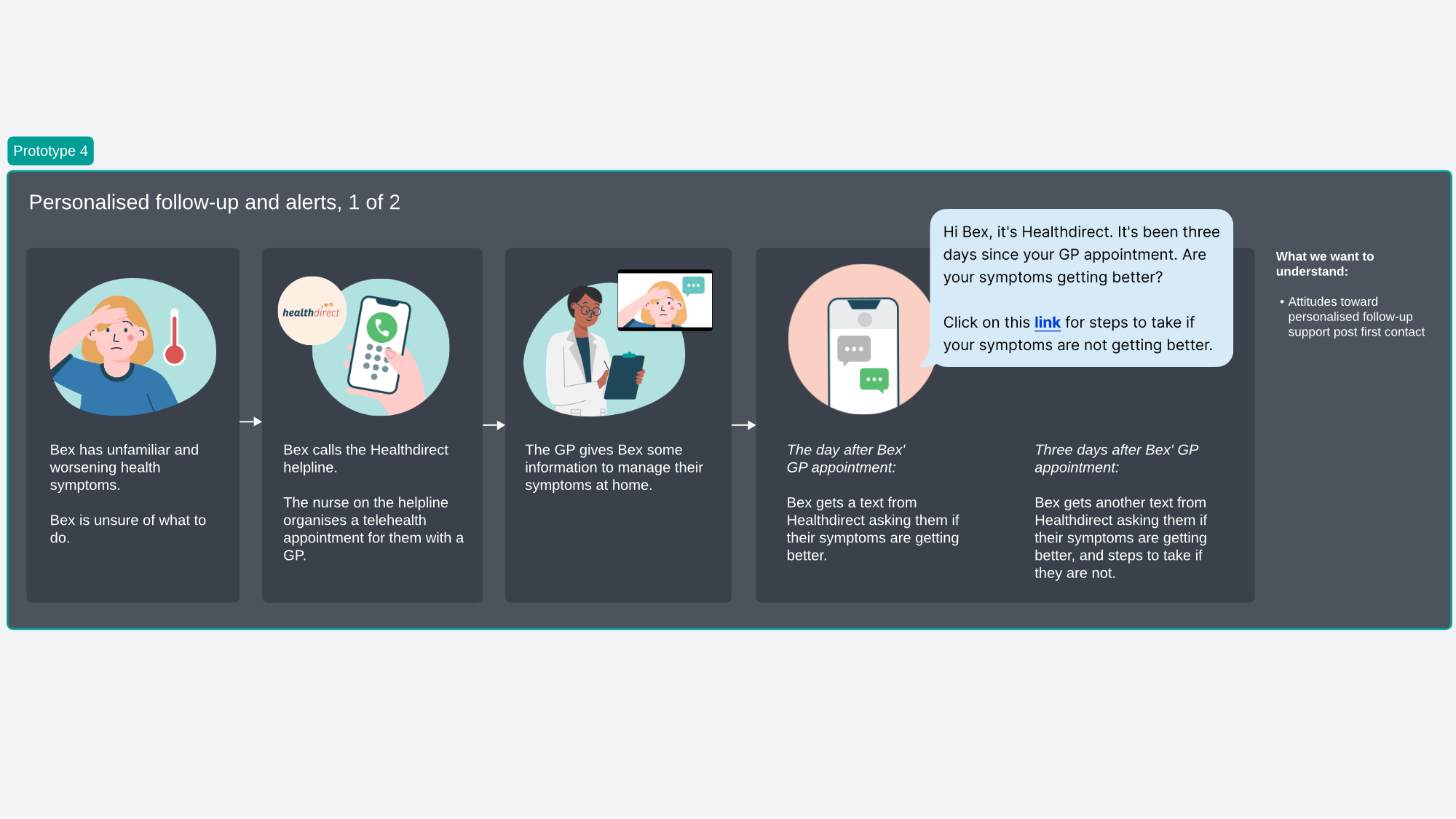
Prototyping service and AI-assisted concepts to provoke discussion in user interviews
Sharing Phase 1 findings to maintain evidence continuity
Contributing to research presentations and cross-functional workshops
This helped teams move from incremental fixes toward a shared view of where investment could deliver the greatest value.


Designing AI for health decisions under stress
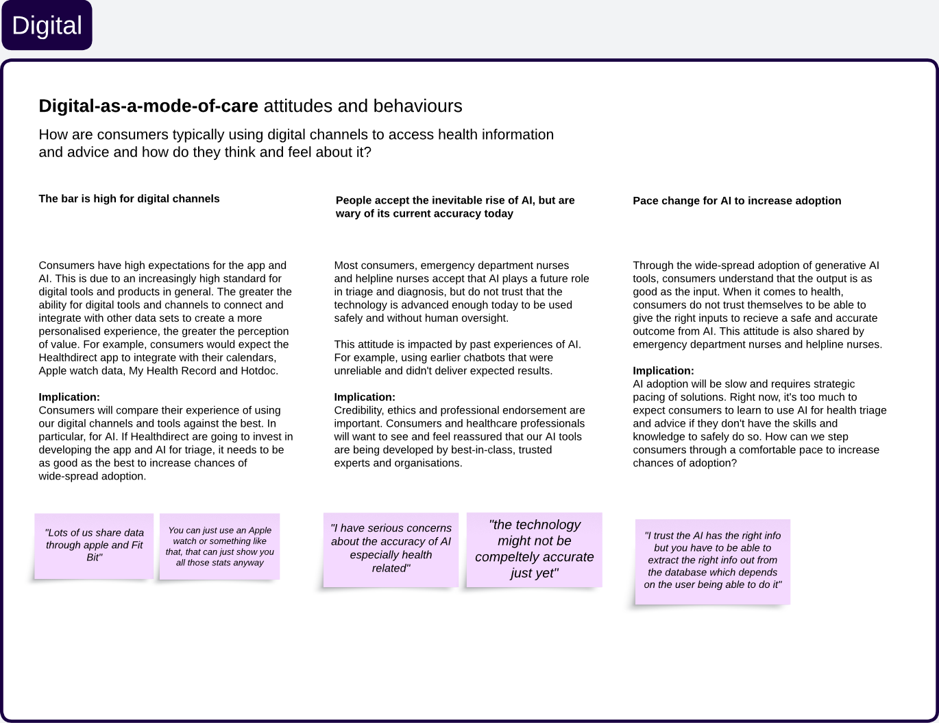
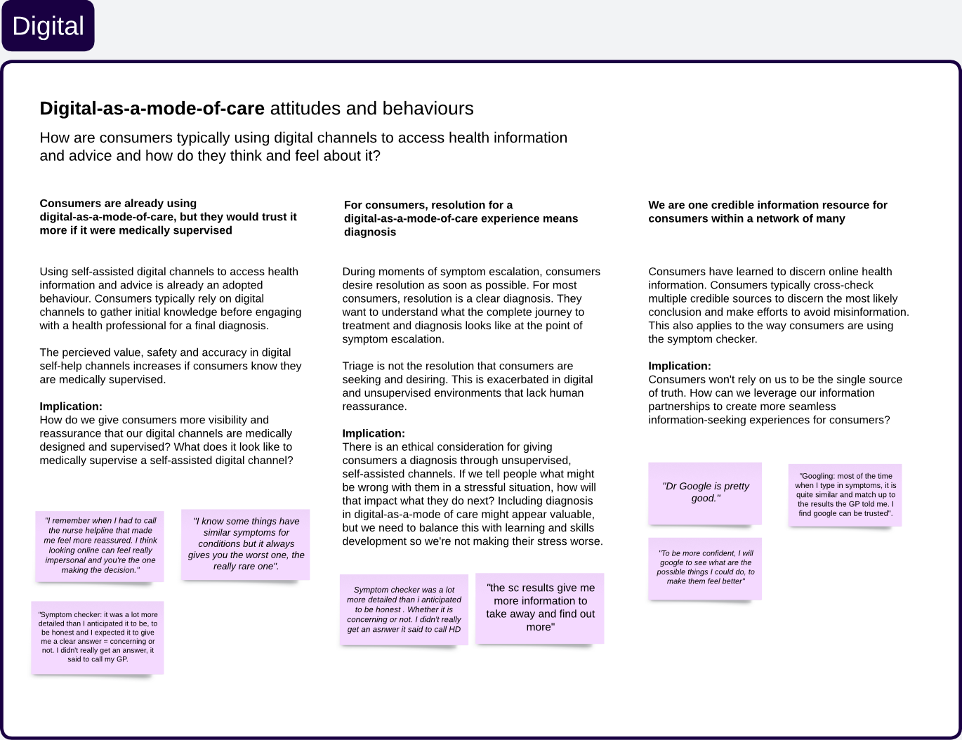
Australians turn to digital tools when anxious or uncertain — moments where AI must build trust, not add confusion.
Digital confidence and self-care ability are unevenly distributed
Users accept AI, but want human oversight
More information doesn't mean more confidence under stress
How this shaped our decisions
Design for what people can cope with, not what the system can do
Explain why a pathway is recommended, not just what to do
Avoid diagnostic language to prevent anxiety escalation
Keep human support visible — self-service can feel like abandonment
Design for the least-resourced user, not the most confident
From insight to opportunity
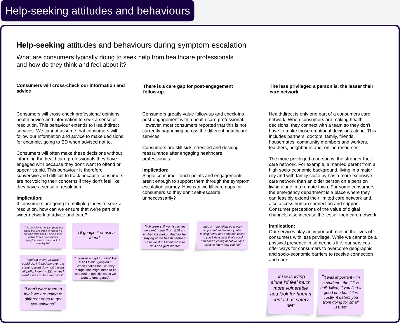
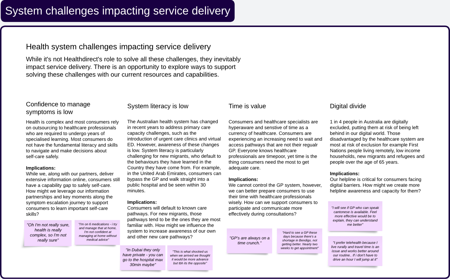
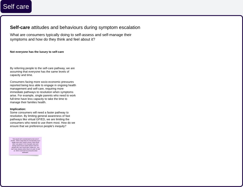
Consumer interviews and synthesis revealed a small number of recurring patterns.
These were translated into clear opportunity themes to guide future design and service decisions.
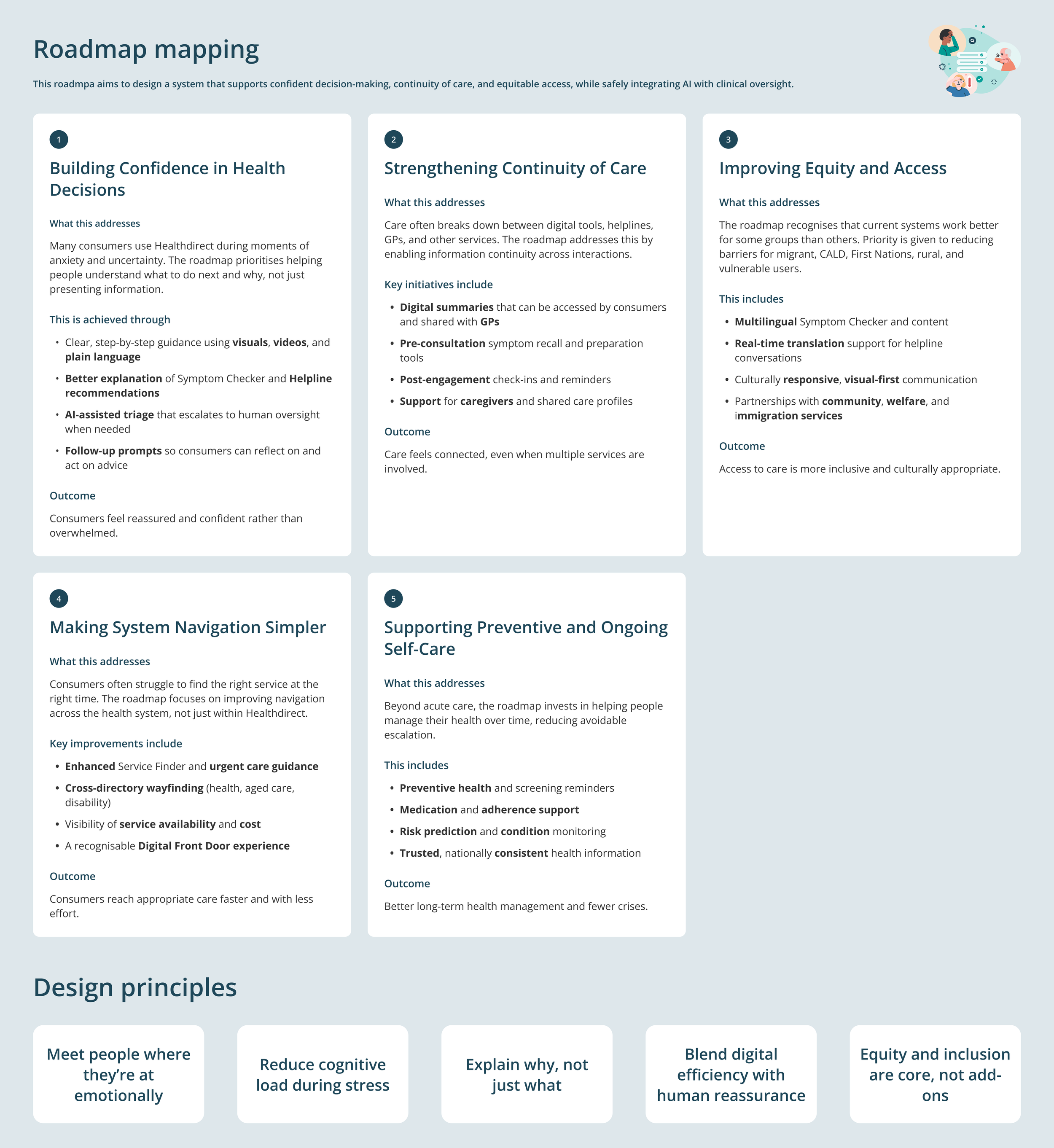
Outcome and impact
The outputs of this phase:
Clarified future-state opportunity areas across Healthdirect services
Informed government funding proposals with evidence-based insights
Provided leadership with tangible artefacts to evaluate strategic options
Created alignment across CX, product, and service design teams on priorities